Design comparison
Solution retrospective
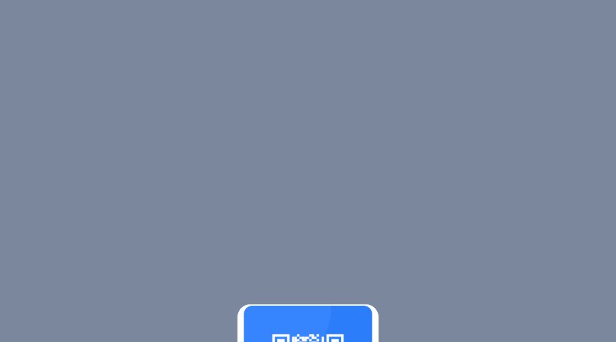
Hello ! This is my first challenge. It's not totally look the same as the screeshots. Especially on the size of the main box. Every return would be greatful and helpful.
Community feedback
- @correlucasPosted about 2 years ago
๐พHi Benjamin, congratulations on your solution!๐ Welcome to the Frontend Mentor Coding Community!
Great solution and a great start! From what I saw youโre on the right track. Iโve few suggestions for you that you can consider adding to your code:
- Use
<main>
instead of a simple<div>
this way you improve the semantics and accessibility showing which is the main block of content on this page. Remember that every page should have a<main>
block and that<div>
doesn't have any semantic meaning. - Replace the
<h2>
containing the main title with<h1>
note that this title is the main heading for this page and every page needs one h1 to show which is the most important heading. Use the sequence h1 h2 h3 h4 h5 to show the hierarchy of your titles in the level of importance, never jump a level. - Add a margin of around
margin: 20px
to avoid the card touching the screen edges while it scales down. - Use relative units as
rem
orem
instead ofpx
to improve your performance by resizing fonts between different screens and devices. These units are better to make your website more accessible. REM does not just apply to font size, but to all sizes as well.
Here's my solution for this challenge if you wants to see how I build it: https://www.frontendmentor.io/solutions/qr-code-component-vanilla-cs-js-darklight-mode-nS2aOYYsJR
โ๏ธ I hope this helps you and happy coding!
Marked as helpful1 - Use
- @Darynka-TapiaPosted about 2 years ago
Hello @BennyBenV, it's great that you completed your first challenge โจ
Here are a few recommendations to get your element centered on the screen:
- You can remove the margin percentage and leave it as margin:0 auto;
- Add Viewport units to the body: width: 100vw; height: 100vh;
- Add flex or grid to move around the layout: justify-content, align-items
https://css-tricks.com/snippets/css/a-guide-to-flexbox/ https://css-tricks.com/snippets/css/complete-guide-grid/
Here's my solution for this challenge if you wants to see it. โ https://www.frontendmentor.io/solutions/qr-code-component-aFQhD4VF3U
Marked as helpful1@BennyBenVPosted about 2 years ago@Darynka-Tapia Hi ! Thanks for the feedback. I'm not familiar yet with the flex and the grid. I'll keep learning !
0
Please log in to post a comment
Log in with GitHubJoin our Discord community
Join thousands of Frontend Mentor community members taking the challenges, sharing resources, helping each other, and chatting about all things front-end!
Join our Discord