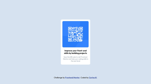
QR code component built with HTML and CSS

Solution retrospective
I take great pride in my continually developing skills, which enable me to optimize my design approach. Specifically, I would leverage alternative CSS units, such as relative units (e.g. percentages, ems, or rems), to define padding and margin values, thereby ensuring my card component is highly responsive and adaptable to various screen sizes and devices.
Let me know if you'd like me to make any adjustments! 🥰
What challenges did you encounter, and how did you overcome them?I successfully utilized CSS flexbox to centrally align my QR code card component, leveraging my understanding of the flexbox module's properties and functionality to achieve the desired layout.
What specific areas of your project would you like help with?Any feedback is welcome. 😊
Please log in to post a comment
Log in with GitHubCommunity feedback
No feedback yet. Be the first to give feedback on Carlos Al's solution.
Join our Discord community
Join thousands of Frontend Mentor community members taking the challenges, sharing resources, helping each other, and chatting about all things front-end!
Join our Discord