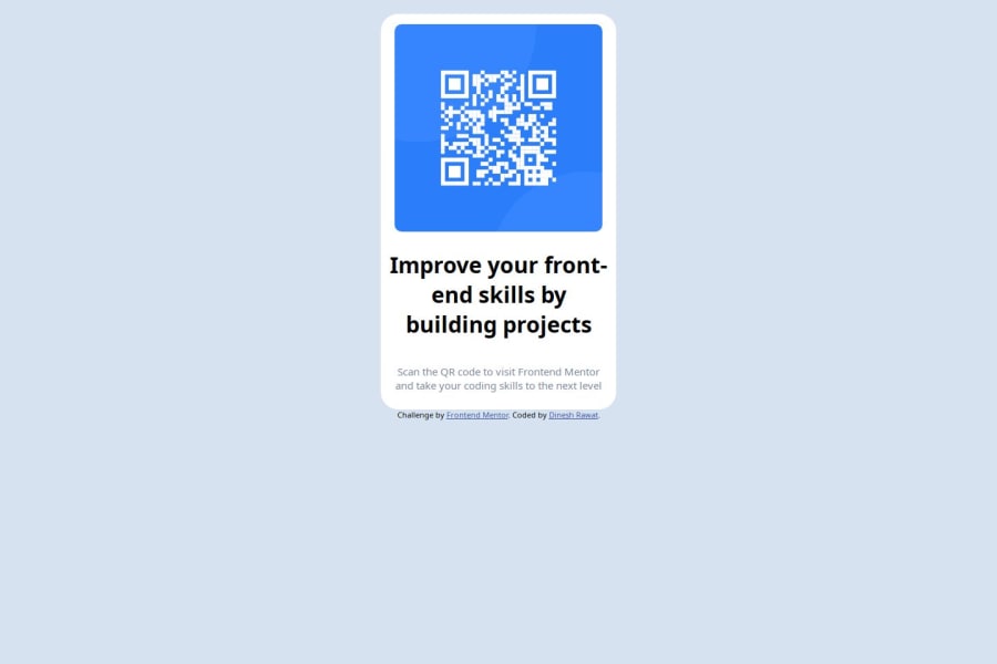
Design comparison
Solution retrospective
I have started building projects and learned the basics of HTML & CSS. I'm proud that I have started learning by doing and not just watch tutorials. I want to know more advance HTML & CSS to build complex projects.
I have improved my project by looking other people code and feedback got from people.
What challenges did you encounter, and how did you overcome them?I had problem to push code to remote github repository, I had to delete github repository twice and create it 3 times and i was able to push the project to github repository from my local machine. I need to focus on learning git commands so i can push my code efficiently in future.
i was trying to build it by very basic HTML & CSS, but when I saw other's code, I need to improve a lot, I need to learn responsive web design.
What specific areas of your project would you like help with?I have used the basic HTML and CSS styles to build the project but I have seen the solution code on github and its HTML & CSS is completely different and advance from mine. I would like to know whether as a beginner, is it ok to use the basic HTML & CSS or should i know the HTML & CSS used in the solution code before strating the project?
Community feedback
- @TedJenklerPosted 3 months ago
Hi @rawatdinesh10,
Nice project! Here are a few suggestions to enhance it:
Global Box-Sizing: Consider adding
- { box-sizing: border-box; } to all your projects.
This ensures that padding and border are included in the element's total width and height, making layout and sizing more predictable.
Also, set HTML, body { margin: 0; } to remove default margins and avoid unexpected layout shifts.
Using <div> for Layout: Use <div> elements to contain and organize your content. Start by outlining the layers you see and style them accordingly. For example, a <div> can be used as a card container, and adding an aria-label can significantly improve accessibility by describing the content for screen readers.
Extra Challenge: For a fun challenge, consider creating your own custom QR code. You can generate one that links to a website or a secret message. It’s a great way to learn more about QR codes and can be a fun addition to your projects.
Hope these tips help!
Best, Teodor
Marked as helpful1@rawatdinesh10Posted 3 months ago@TedJenkler thank you so much for your valuable feedback.
1@gmagnenatPosted 3 months agoHi @rawatdinesh10, to help with box-sizing, correct image sizes, reset margins, and more, you should add a modern CSS reset at the top of the stylesheet in all of your projects. Look up Andy Bell's Modern CSS reset and use that one. It will help you deal with browser inconsistencies and make your life easier.
0 - @MikDra1Posted 3 months ago
To make the image the size that you want I encourage you to use this technique to make the card responsive with ease:
.card { width: 90%; max-width: 600px; }
On the smaller screens card will be 90% of the parent (here body), but as soon as the card will be 600px it will lock with this size.
Also to put the card in the center I advise you to use this code snippet:
.container { display: grid; place-items: center; }
Hope you found this comment helpful 💗💗💗
Good job and keep going 😁😊😉
Marked as helpful1@rawatdinesh10Posted 3 months ago@MikDra1 thank you much for your valuable feedback.
0@gmagnenatPosted 3 months ago@rawatdinesh10 you don't need this on the image. The card itself should take a max-width. The image takes 100% of its container (this is done in the CSS reset) and you just add a padding to the card to add a bit of space.
0 - @Mina546845414h55gPosted 3 months ago
Hello , you want to give the body bg-color as in style giude and after this give the card a white color and give the imge margin 20px and after this edit the content and thanks
Marked as helpful1 - @gmagnenatPosted 3 months ago
Hi, with the different feedback you received, here is a list of the important points you should study.
Semantic HTML and Accessibility
- Add a
<main>
element: This helps show where the main content of your page is. - Use
<footer>
for attribution: Put the attribution inside a<footer>
element.
CSS and Layout
- Start your stylesheet with a modern CSS reset in all your projects. This helps handle browser defaults and gives you a clean starting point. Look up for Andy Bell Modern CSS Reset.
- The recommanded way to center a card like this is with flexbox on your body or parent container. You'll need to add a
min-height:100vh
on this container for it to work properly. - You don’t need to wrap everything in
<div>
tags. Instead, add classes directly to the elements you want to style. This makes your HTML simpler. - Instead of a fixed width, use
max-width
so the card can adjust to different screen sizes. - Don’t set a fixed width for images. Use
width: 100%
so the image fits its container properly. - Use units like
em
,rem
, or percentages for font sizes. This helps text adjust based on user settings. - Instead of fixed pixel widths for text, use the
ch
unit to limit the number of characters. This makes the text fit better. - For this challenge, you don’t need media queries. Just make sure your layout works well as it is.
I hope these tips help you improve your code. If you have any questions or need more details, just ask.
Happy coding!
0 - Add a
Please log in to post a comment
Log in with GitHubJoin our Discord community
Join thousands of Frontend Mentor community members taking the challenges, sharing resources, helping each other, and chatting about all things front-end!
Join our Discord