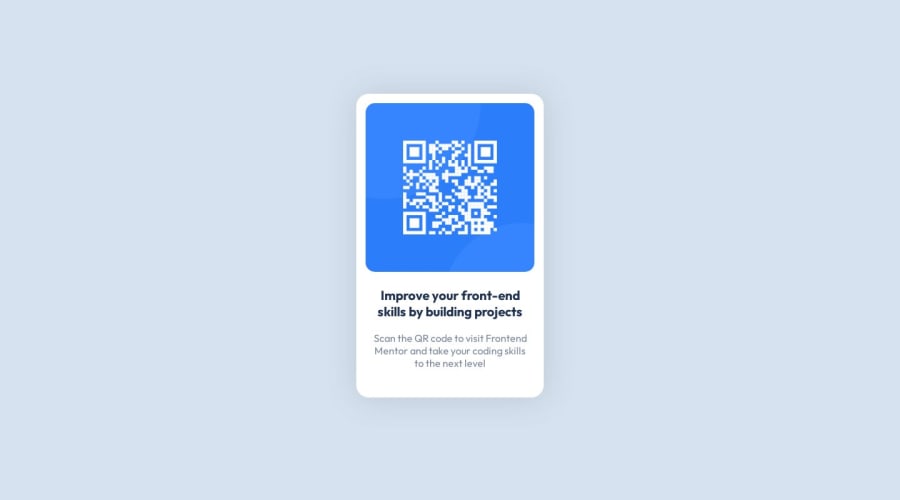
Design comparison
Solution retrospective
This is my first challenge. Any feedback is appreciated. Thanks!
Community feedback
- @LarsiParsiiPosted about 1 year ago
Looks very good, but there are some things you could do to improve it:
1.If you start with the full width desktop view, and then try to decrease the width (but still not so low that your media query sets in), you will see that the space available for the qr code and text is way too small, and it can only fit a word or so on each line. How can you fix this? Well, there's no need to use a media query, as you don't want the layout itself to change when crossing a certain width. Instead, define a max-width in units of px, ch, etc. such that it never gets too wide, such as 30ch. Adding a width of 80% will ensure that the qr code and text always fits on narrower screens. I would suggest looking up the clamp() function in order to simplify widths and heights in the future. Speaking of heights...
2.Your design is not centered in the browser, as you probably noticed. This is due to the parent container, main, not taking up the full viewport height (i.e. the height of the available space in your browser). If you enter the DevTools and press CTRL + SHIFT + C, you will be able to use your mouse to highlight the different elements on your site directly (which is a lifesaver) and see the space occupied by the main element. It's often a good idea to have a container element (like a div) encapsulate all the content on your page, as opposed to styling the body itself. Adding
height: 100vh,display: flex,flex-direction: column, andjustify-content: centerto that container should center all of your content vertically. Also add your attribution to this container, if you want to center it as well (which you may want)..Marked as helpful2@lrobb95Posted about 1 year agoJust to touch up on that wonderful and very detailed explanation by Lars, I believe what was meant was
flex-direction: column;The rest is spot on! @estrelicia
Marked as helpful1@LarsiParsiiPosted about 1 year ago@lrobb95 You're right! I've gone ahead and edited it now. ;) So nice seing my limited knowledge being correct! :D
1 - @JeuriMorelPosted about 1 year ago
You should avoid using
pxfor fonts. Here's a detailed article showing you how to create responsive and accessible typography.Marked as helpful1
Please log in to post a comment
Log in with GitHubJoin our Discord community
Join thousands of Frontend Mentor community members taking the challenges, sharing resources, helping each other, and chatting about all things front-end!
Join our Discord
