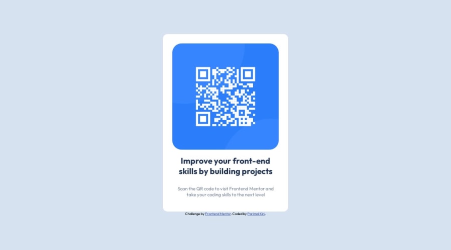
Design comparison
Community feedback
- @rayaattaPosted 10 months ago
Hello Parimal Kini👋, congratulations on completing this challenge 🎉
I have some suggestions you might find interesting.
1 The Alt attribute should have text including where the qr code leads. I.e
alt="qr code leading to frontendmentor.io"2 Remove the
<div class= "attribution">from the main and change it to<footer class="attribution">And wrap it's text inside apelement. This improves accessibility and SEO since it is much more semantic.3 I noticed
font-size: 15px;in your code. You should never use pixels when setting font related properties. Setting font sizes in pixels causes accessibility problems with people who adjusted their default font sizes on their computers.The best units for setting font size are relative units such as rem and em which can adjust with the user preferences. Checkout this article why font size should never be in pixels
I hope this helps 🙃
Your solution is awesome ,I also liked the fact that it is very semantic👏
Happy coding ✌️
1
Please log in to post a comment
Log in with GitHubJoin our Discord community
Join thousands of Frontend Mentor community members taking the challenges, sharing resources, helping each other, and chatting about all things front-end!
Join our Discord
