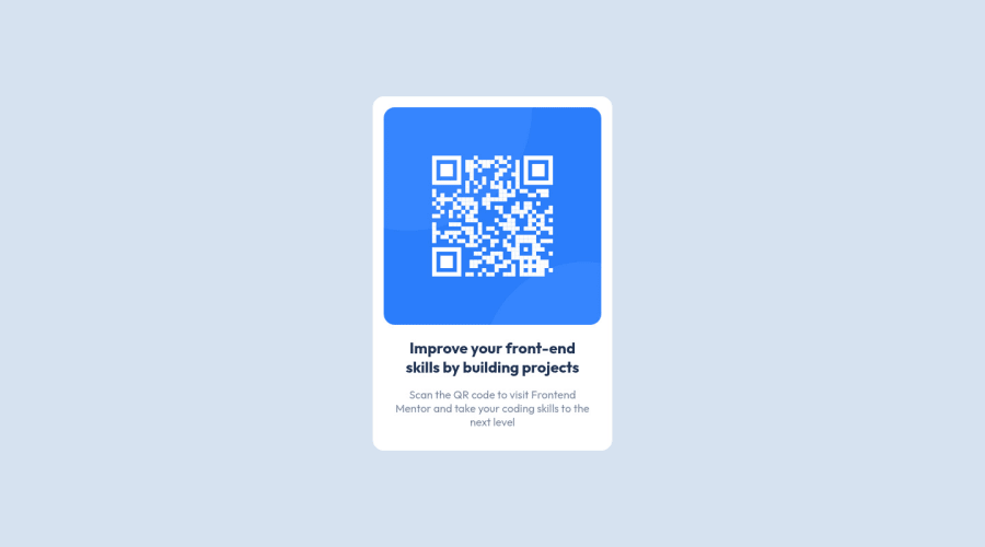
Design comparison
Community feedback
- @correlucasPosted about 2 years ago
👾Hello @john-jpann, Congratulations on completing this challenge!
Great code and great solution! I’ve few suggestions for you that you can consider adding to your code:
Your solution is great and the code is working, but the HTML structure can be reduced by removing unnecessary divs, all you need is a single
<main>or<div>to keep all the content inside, and nothing more. The ideal structure is thedivand only the image, heading, and paragraph.Here’s one example to show can be cleaner this HTML structure:
<body>
<main>
<img src="./images/image-qr-code.png" alt="QR Code Frontend Mentor" >
 <h1>Improve your front-end skills by building projects</h1>
<p>Scan the QR code to visit Frontend Mentor and take your coding skills to the next level</p>
</main>
</body>
To reduce the CSS you can use the direct selector for each element instead of using
classthis way you have a code even cleaner, for example, you can select everything using the direct selector for (img, h1, and p, main).✌️ I hope this helps you and happy coding!
Marked as helpful1
Please log in to post a comment
Log in with GitHubJoin our Discord community
Join thousands of Frontend Mentor community members taking the challenges, sharing resources, helping each other, and chatting about all things front-end!
Join our Discord
