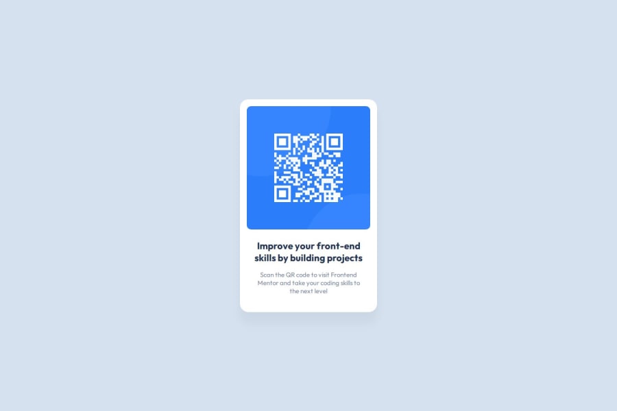
Design comparison
SolutionDesign
Solution retrospective
What are you most proud of, and what would you do differently next time?
It was a simple project, I'm looking forward to tackling more complex ones next.
What challenges did you encounter, and how did you overcome them?I spend some time trying to figure out how to center the card inside the body using flex. It took a while to figure out that I need to set the body height for vertical alignment. This is still hard to understand, because horizontal alignment seems to work perfectly fine even without setting body width explicitly.
What specific areas of your project would you like help with?None for this project.
Community feedback
Please log in to post a comment
Log in with GitHubJoin our Discord community
Join thousands of Frontend Mentor community members taking the challenges, sharing resources, helping each other, and chatting about all things front-end!
Join our Discord
