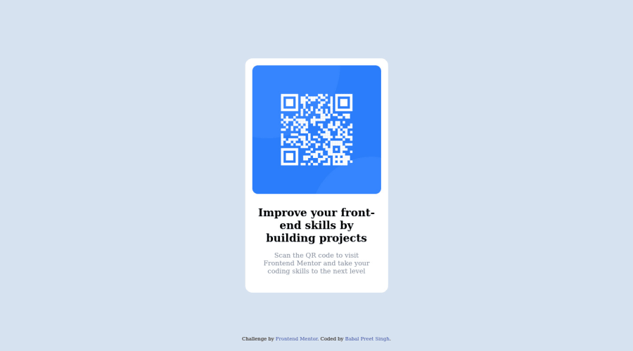
Design comparison
SolutionDesign
Community feedback
- @HassiaiPosted almost 2 years ago
Replace <div class="flex"> with the main tag, <h3> with <h1> to fix the accessibility issues. click here for more on web-accessibility and semantic html
There is no need to style .flex, five its styling to the body. To center .container of the body, replace the height with min-height:100vh.
Give h1 and p a font-size of 0.9375rem which is 15px.
Hope am helpful.
Well done for completing this challenge. HAPPY CODING
0
Please log in to post a comment
Log in with GitHubJoin our Discord community
Join thousands of Frontend Mentor community members taking the challenges, sharing resources, helping each other, and chatting about all things front-end!
Join our Discord
