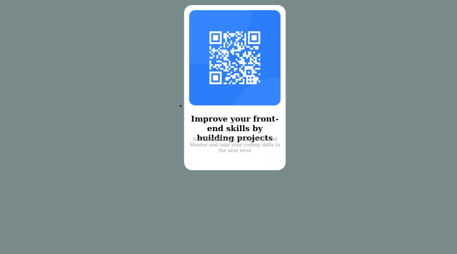
Design comparison
Community feedback
- @MohmedElshaarawyPosted about 2 years ago
Hi, Mark Añasco Good job on completing the challenge!
I have some suggestions about your code that might interest you.
HTML
Use the <main> tag to wrap up all the main content of the page instead of the <div> tag. With this semantic element, you can improve the accessibility of your page. Use the <footer> tag to wrap the footer of the page instead of the <div class="attribution">. The <footer> element contains information about the author of the page, the copyright, and other legal information. Since this component involves scanning the QR code, the image is not a decoration, so it must have an alt attribute. The alt attribute should explain its purpose. e.g. QR code to frontendmentor.io CSS
Instead of using pixels in font size, use relative units like em or rem. The font size in absolute units like pixels does not scale with the user's browser settings. This can cause accessibility issues for users who have set their browser to use a larger font size. You can read more about this here. Use min-height: 100vh instead of height: 100vh. The height property will not work if the content of the page grows beyond the height of the viewport. I hope you find it useful!
Happy coding❤️
0@MarkAnasco14Posted about 2 years ago@MohmedElshaarawy thank you for correction, i will do my best to do my duty.
1 - @HassiaiPosted about 2 years ago
Replace <div class="mark"> with the main tag to fix the accessibility issue. click here for more on web-accessibility and semantic html. There is need for the <ul> and <li> in this challenge.
The body has a wrong background-color. Use the colors that were given in the styleguide.md found in the zip folder you downloaded.
To center .mark on the page using flexbox, add min-height:100vh; display: flex; align-items: center: justify-content: center; to the body.
To center .container on the page using flexbox:
body{
min-height: 100vh;
display: flex;
align-items: center;
justify-content: center;
}
There is no need to give .mark a height value.
Give h1 and p the same font-size value of 15px , the same margin-left, margin-right and margin-top values. Give p a margin-bottom value.
Use relative units like rem or em as unit for the padding, margin, width values and preferably rem for the font-size values, instead of using px which is an absolute unit. For more on CSS units Click here
Hope am helpful.
Well done for completing this challenge. HAPPY CODING
0@MarkAnasco14Posted about 2 years ago@Hassiai thank you for correction, i will do my best to do my duty.
0
Please log in to post a comment
Log in with GitHubJoin our Discord community
Join thousands of Frontend Mentor community members taking the challenges, sharing resources, helping each other, and chatting about all things front-end!
Join our Discord
