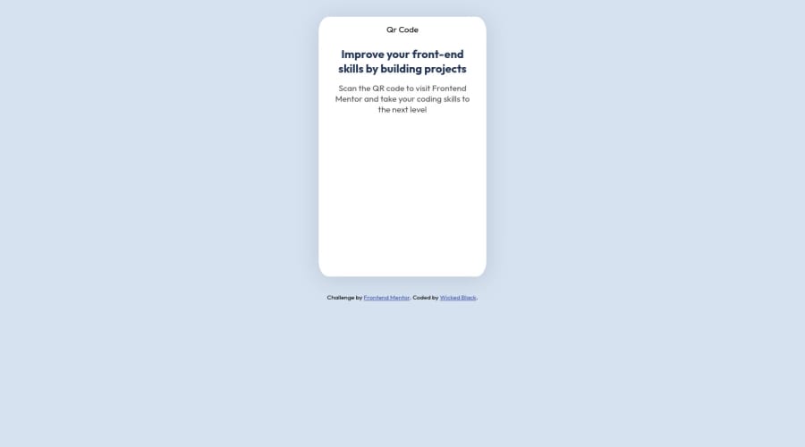
Design comparison
Solution retrospective
-
Sizing is something I find difficult. how or what is the process used when starting a project, and sizing it to the size stated in the style guide?
-
I was trying to add an animation to the QR image. Could you tell me how to make the background blurry or dim, so the QR image is the only thing in focus when you hover over the image?
-
any feedback is welcome, please feel free to suggest anything even if unrelated to the questions above.
Thank YOU!
Community feedback
- @Programming-School-Pro-CodingPosted over 2 years ago
Hi @WickedBlack
There is a problem: In index.html line 30 change the code to:
<img src="./image-qr-code.png" alt="Qr Code">to be the image seen in the website
I have some suggestions:
- Make The Code Semantic by put in the div with className attribution this code to be semantic:
<footer class="attribution">
    <p>Challenge by <a href="https://www.frontendmentor.io?ref=challenge" target="_blank">Frontend Mentor</a>.</p>
    <p>Coded by <a href="#">Wicked Black</a>.</p>
  </div>
and put this code in the div with className container to be semantic:
<main class="container"> <article class="card"> <img src="images\image-qr-code.png" alt="Qr Code"> <h2>Improve your front-end skills by building projects</h2> <figcaption> Scan the QR code to visit Frontend Mentor and take your coding skills to the next level</figcaption> </article> </div>-
remove the style tag in the head tag
-
to be the card in the middle of the page use the following code:
body {
    display: flex;
  flex-direction: column;
  align-items: center;
  justify-content: center;
  gap: 3.5rem; /* separation between the card and attribution */
  min-height: 100vh;
}
Marked as helpful1 - @phichayut-pakPosted over 2 years ago
Hi! Congrats on your first project submission! 🎉🎉 Here are some suggestions from me:
-
Check your image if it works when your website is deployed. From what I've seen in your code, you assigned the wrong path in
<img>tag. How you can fix is to change it to<img src="./image-qr-code.png" alt="Qr Code"> -
Sizing doesn't matter that much in here. But if you really want to make it challenging, it's easier for you to buy premium since you'll get an access to figma design which is more accurate than jpeg/png image.
-
From your second question, I would recommend you implement JavaScript to make it interactive as you want user to hover, the qr code will scale up and background will get blurred.
-
Try to make it to the center by making use of flexbox, it's one of the important features in css.
-
Even though you're trying to make the qr code scales up on hover, but it might be a bit big. You might want to scale that down. Moreover, when user quits hovering the qr code, it immediately quits the scaling. You should try using transition on this.
Happy Coding 👨💻👨💻
Marked as helpful1 -
Please log in to post a comment
Log in with GitHubJoin our Discord community
Join thousands of Frontend Mentor community members taking the challenges, sharing resources, helping each other, and chatting about all things front-end!
Join our Discord
