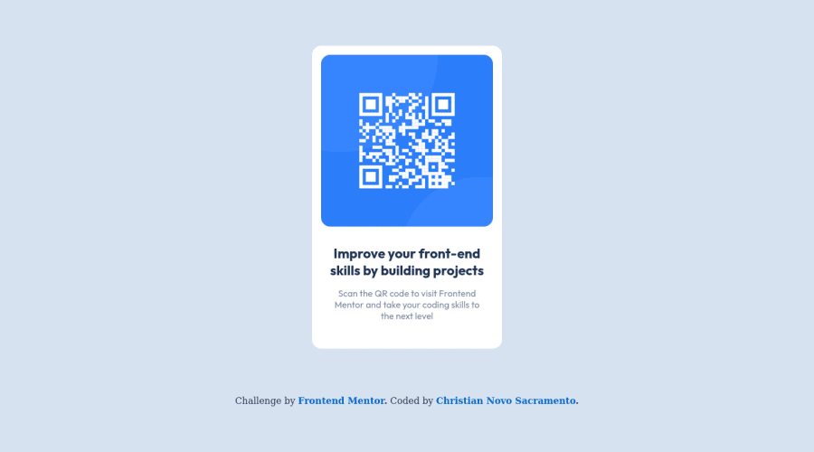
Design comparison
SolutionDesign
Solution retrospective
- Is it semantic correct?
- Should I use always class names instead of high level tags?
- Should I import font in HTML or CSS?
- What could I improve in my CSS?
Community feedback
Please log in to post a comment
Log in with GitHubJoin our Discord community
Join thousands of Frontend Mentor community members taking the challenges, sharing resources, helping each other, and chatting about all things front-end!
Join our Discord
