Design comparison
Solution retrospective
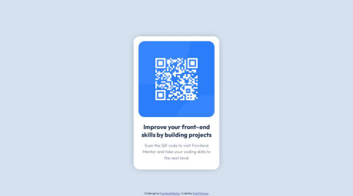
Here is my first take at the QR Code Challenge!
It was a fun challenge, and I only had a few struggles during creation. I had a bit of trouble with how to center the container vertically, so if anyone has any suggestions on how I can achieve this better than I have, it'd be greatly appreciated.
Also, if you think any areas could be refactored to reduce code bloat, please tell me! As I believe sometimes, I can use too many lines to achieve something that could be done in a much cleaner fashion.
Community feedback
- @fernandolapazPosted over 1 year ago
Hi 👋, perhaps some of this may interest you:
HTML / ACCESSIBILITY:
- The main content of every page (the card in this case) should be wrapped with the
<main>
tag.
- Every page should have an
<h1>
to improve user experience and because it is an important element when it comes to SEO. It is good not to skip heading levels.
CSS:
- The page content could be centered using Grid or Flexbox. For example as follows:
body { min-height: 100vh; display: grid; place-content: center; }
- It is better to use
min-height: 100vh;
for the body, as usingheight
causes the page to be cut off in viewports with small height (such as mobile landscape orientation). Also, there's no need to set a width to 100%, as block elements are full width by default.
- You might consider using relative units like rem or em since they are better for scalable layouts. Something simple to start with would be to convert to rem (1 rem equals the font size of the root element, 16px by default).
- You don't need to use
font-weight
of 400 and 700 as these are the default values for normal and bold fonts (paragraphs and headings).
I hope you find it useful, any questions do not hesitate : )
Regards,
Marked as helpful1 - The main content of every page (the card in this case) should be wrapped with the
- @Q8LPs6VsPosted over 1 year ago
You did the centering right. No need to change it. HTML is fine.
I'm not sure how I feel about the position: absolute on the body. Without it you don't need to set a width and height on the body. The padding on the body isn't really needed either I think, and causes a vertical scrollbar for me.
"Container" and "wrapper" are IMO words used for the same purpose - which in your case is fulfilled by the wrapper class - maybe consider giving the container class a different name.
You could use the <main> tag for the div with the class container, which is semantic HTML. Also, the attribution div could be <footer> instead, which will remove the notice you probably get in the accessibility report.
I don't really any reason for the <br /> in the paragraph. Also, the margin 0 auto on .container doesn't really do anything because you already centered it with flexbox.
Some other small things:
You could change the font-size from px to rem and the margin / padding to em if you know how.
margins, box-shadows etc: Instead of 0px (or whatever unit you use) you can just write 0.
height: auto on the img doesn't do anything here, I think.
Either way, it's small details, good job on the project!
Marked as helpful1
Please log in to post a comment
Log in with GitHubJoin our Discord community
Join thousands of Frontend Mentor community members taking the challenges, sharing resources, helping each other, and chatting about all things front-end!
Join our Discord