@AdrianoEscarabote
Posted
Hi Anna, how are you?
I really liked the result of your project, but I have some tips that I think you will enjoy:
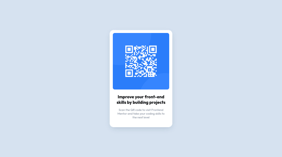
As you know this page is just a component, so it doesn't even need an h1
! because we don't know how important the other components of the site will be! but it's always good to prevent accessibility errors so I think it would be good for you to add an h1
in this component, besides being a good practice for when you are developing larger sites, don't worry forget about h1
. to resolve this, replace h2
with h1.
Wrap all the content with the main tag to inform what the main content of the page is, taking into account that this challenge is just a component, we can wrap all the content!
The rest is great!
I hope it helps... 👍
@NitaLewska
Posted
@AdrianoEscarabote
Hi! I think that it's not really necessary to make this all just to pass the test, and it's obvious that it's just a card, so it can't have even an h2 tag - maybe h4 or even just a span. Of course, in a bigger project, it's necessary to have the full and clear structure - header, main, footer, h1 and so on, but is it really necessary when you make just a reusable card component? I've started studying React not so long ago, and i like the idea of reusable components a lot!)
Thanks for your advice anyways =)
@AdrianoEscarabote
Posted
@NitaLewska =)