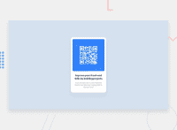
Design comparison
Solution retrospective
Please how and where should I use the mobile and desktop width provided in the style-guide.md file, I was able to achieve this design without using it
Community feedback
- @Dami-MoorePosted over 2 years ago
Hello Joel! Congratulations on completing this project. To give feedback as requested, we'll need your code. However, on clicking to view your code, it seems like you haven't uploaded your code on your Github. I can only see the read.me file. Please check.
Thank you. Happy Coding!
Marked as helpful0@Jaybabson007Posted over 2 years ago@Dami-Moore Thank you for the observation, I've uploaded the files as requested and I await your response.
Thank you!
0 - @Dami-MoorePosted over 2 years ago
It's working now.
Great work, great coding. The desktop and mobile widths given within the style guide are to help with the responsive designs. So, at 1440px, you have the desktop view and at 375px, you have the mobile view. You'll need to understand how to use media queries to get this (I'm sorry if I wrongly assumed that you don't ).
On Accessibility and HTML issues:
- Section tags are usually within the main tag not the other way round as in your code.
- It's also preferable to have your image tags contained within divs.
I hope this was helpful? Happy coding!
0@Jaybabson007Posted over 2 years ago@Dami-Moore I really appreciate your review it just resolved a doubt I initially had, I'll effect the corrections ASAP. Thanks once again and I hope to hear from you soon.
Happy coding!
0
Please log in to post a comment
Log in with GitHubJoin our Discord community
Join thousands of Frontend Mentor community members taking the challenges, sharing resources, helping each other, and chatting about all things front-end!
Join our Discord

