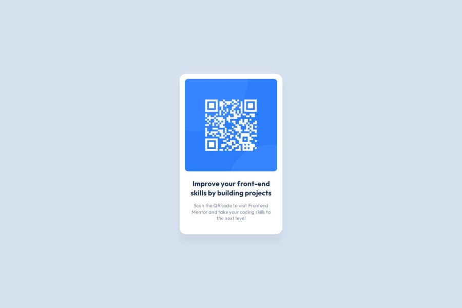
Design comparison
SolutionDesign
Solution retrospective
What are you most proud of, and what would you do differently next time?
I began improving the website's accessibility by implementing several changes, such as using CSS preload to speed up loading times, replacing pixels (px) with relative units (rem), and substituting divs with semantic HTML elements.
What specific areas of your project would you like help with?I would like assistance with correcting the semantic HTML in my project and identifying any missing best practices.
Community feedback
Please log in to post a comment
Log in with GitHubJoin our Discord community
Join thousands of Frontend Mentor community members taking the challenges, sharing resources, helping each other, and chatting about all things front-end!
Join our Discord
