

Design comparison

Community feedback
- P@Islandstone89Posted 5 months ago
HTML:
-
Every webpage needs a
<main>that wraps all of the content, except for<header>andfooter>. This is vital for accessibility, as it helps screen readers identify a page's "main" section. Wrap the card in a<main>. -
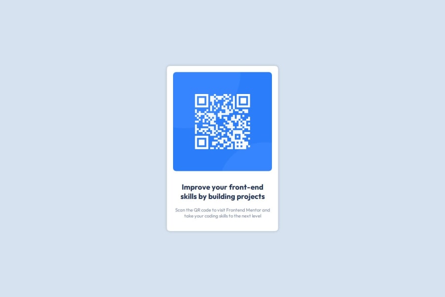
The alt text must also say where it leads(the frontendmentor website). A good alt text would be "QR code leading to the Frontend Mentor website."
-
I would change the heading to a
<h2>- a page should only have one<h1>, reserved for the main heading. As this is a card heading, it would likely not be the main heading on a page with several components.
CSS:
-
Including a CSS Reset at the top is good practice.
-
I recommend adding
1remofpaddingon thebody, to ensure the card doesn't touch the edges on small screens. -
On the
body, changeheighttomin-height: 100svh- this way, the content will not get cut off if it grows beneath the viewport. You can also remove themargin. -
The card should not have a set width, as we want it to be able to grow and shrink according to different screen sizes. However, we do want to limit the width so it doesn't stretch too wide on larger screens. To solve these issues, change
width: 20remtomax-width: 20rem. -
font-sizeonbodymust also be set in rem, this is vital for accessibility, as usingpxprevents the font from scaling when a user changes their default font size in the browser. -
Paragraphs have a default value of
font-weight: 400, so there is no need to declare it. -
As the design doesn't change, there is no need for any media queries. When you do need them, they should be in
remorem, notpx. Also, it is common practice to do mobile styles first and use media queries for larger screens.
0 -

Please log in to post a comment
Log in with GitHubJoin our Discord community
Join thousands of Frontend Mentor community members taking the challenges, sharing resources, helping each other, and chatting about all things front-end!
Join our Discord