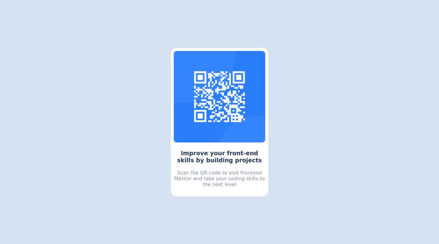
Design comparison
SolutionDesign
Solution retrospective
Hey there everyone! i've learned new ways of centering projects and cleaner ways of writing code :)
Community feedback
- @Deevyn9Posted over 2 years ago
Hi, congrats on completing this solution, Your solution really looks great and responsive. However, you'll need to add left and right padding to the body so there would be a bit of spacing between the container and the body when it goes below 320px. 10px of padding should be enough.
Happy Coding!
Marked as helpful0
Please log in to post a comment
Log in with GitHubJoin our Discord community
Join thousands of Frontend Mentor community members taking the challenges, sharing resources, helping each other, and chatting about all things front-end!
Join our Discord
