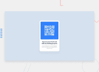
Design comparison
Community feedback
- @HassiaiPosted almost 2 years ago
Replace <div class="container_entire"> with the main tag, <h2> with<h1> and <div class="attribution"> with the footer tag to fix the accessibility issues. for more on semantic html visit https://web.dev/learn/html/semantic-html/
To center .container_entire on the page using flexbox, add align-items: center: justify-content: center; and min-height:100vh; to the body. There is no need for flex-direction: column; and a margin top value. there is no need to give .container_entire a margin value.
Replace the width in .container_entire with a max-width, for a more responsive content. Give it .container_entire a paddin value for all the sides. Give the img a max width of 100% instead of a fixed width value
Hope am helpful. Happy coding.
Marked as helpful0@FaberBenjaminPosted almost 2 years ago@Hassiai I admit, I forgot to adjust the height of the body.Probably it was mainly because I used to use a lot the 'vh' and 'vw' values but I realized that they might do some " interesting " actions if you change your page or you want to zoom in. Other than that in this case that would be the solution, so thank you :D.
1 - @MelvinAguilarPosted almost 2 years ago
Hi there 👋. Good job on completing the challenge ! I have some feedback for you if you want to improve your code.
- Use the
<main>tag to wrap all the main content of the page instead of the<div>tag. With this semantic element you can improve the accessibility of your page.
- Use the
<footer>tag to wrap the footer of the page instead of the<div class="attribution">. The<footer>element contains information about the author of the page, the copyright, and other legal information.
- You must use a level-one heading (h1) even though this is not a full-page challenge. You can create an '<h1>' element within your 'main' element that will be hidden visually but visible and readable by screen readers. The class "sr-only" hides content visually and here are the styles to copy. e.g.:
<h1 class="sr-only">QR Card Component</h1>
- The
altattribute should explain the purpose of the image. Uppon scanning the QR code, the user will be redirected to the frontendmentor.io website, so a betteraltattribute would beQR code to frontendmentor.io
- The
altattribute should not contain the words "image", "photo", or "picture", because the image tag already conveys that information.
If you want to learn more about the
altattribute, you can read this article.- Instead of using pixels in font-size, use relative units like
emorrem. The font-size in absolute units like pixels does not scale with the user's browser settings. This can cause accessibility issues for users who have set their browser to use a larger font size. You can read more about this here.
I hope you find it useful! 😄 Above all, the solution you submitted is great!
Happy coding! 🎄
0 - Use the
Please log in to post a comment
Log in with GitHubJoin our Discord community
Join thousands of Frontend Mentor community members taking the challenges, sharing resources, helping each other, and chatting about all things front-end!
Join our Discord

