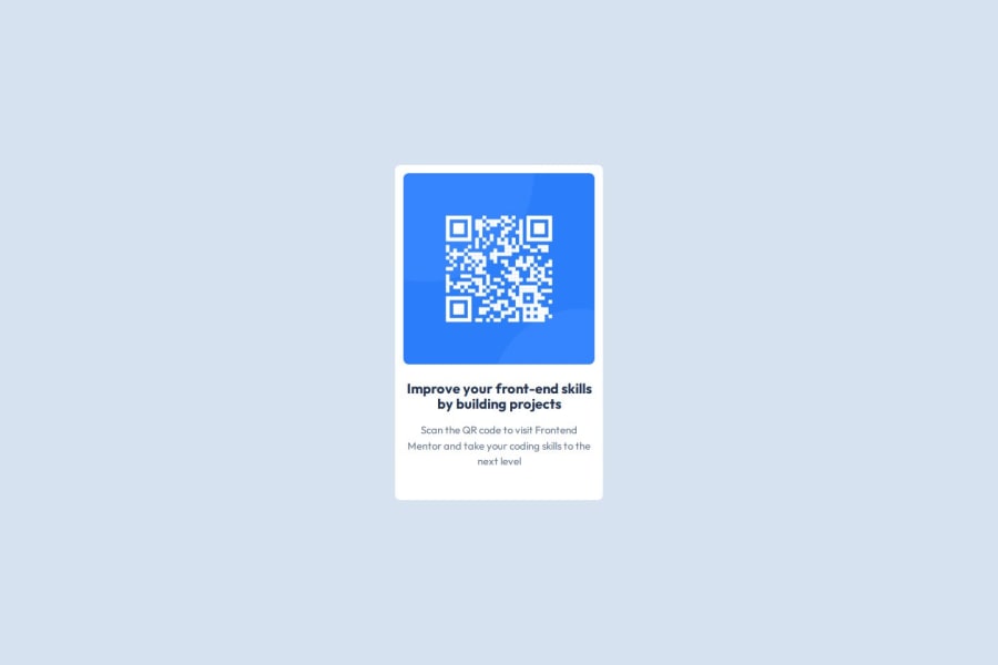


Design comparison

Solution retrospective
Increasing card width as screen size increases
Community feedback
- @MikDra1Posted about 2 months ago
Well done, here are some things to review 😊:
-
REM for Units: It's best to use
remfor all units instead ofpx, as this ensures scalability and consistency in spacing and font sizes based on the user's root font size. It helps improve accessibility. -
Semantic HTML: Consider ensuring all elements are wrapped in semantic HTML tags like
<main>,<section>, and<article>to enhance the structure and SEO-friendliness of the page. -
BEM/Convention for Class Naming: Apply a class naming convention like BEM (Block Element Modifier) to make the styles modular and more maintainable. For example, use
.card__titleor.card--highlighted. -
CSS Reset: Consider adding a full modern CSS reset (like normalize.css or custom resets at the beginning of the stylesheet) to ensure consistent styling across different browsers. Here is a link to one I really like.
-
Clamp() for Responsiveness: Use the
clamp()function for fluid typography and spacing, allowing elements to resize smoothly between a minimum and maximum value based on the viewport size (e.g.,font-size: clamp(1rem, 2vw, 1.5rem)). -
Responsive Card: To make the card responsive, ensure the layout uses
flexorgridcombined with max-width instead of fixed width values. This will make the design more flexible and adapt better to different screen sizes. -
Use max-width/min-width and max-height/min-height: Instead of using fixed
widthandheight, opt formax-widthormin-widthto allow the elements to resize smoothly on different screen sizes, improving overall responsiveness.
Hope you found this comment helpful 💗💗💗
Good job and keep going 😁😊😉
Marked as helpful1 -
- @StroudyPosted about 2 months ago
Awesome job tackling this challenge! You’re doing amazing, and I wanted to share a couple of suggestions that might help refine your approach…
-
Having a clear and descriptive
alttext for images is important because it helps people who use screen readers understand the content, making your site more accessible. It also improves SEO, as search engines usealttext to understand the image's context, helping your site rank better, Check this out Write helpful Alt Text to describe images, -
Using a full modern CSS reset is beneficial because it removes default browser styling, creating a consistent starting point for your design across all browsers. It helps avoid unexpected layout issues and makes your styles more predictable, ensuring a uniform appearance on different devices and platforms, check out this site for a Full modern reset
-
For future project, You could downloading and host your own fonts using
@font-faceimproves website performance by reducing external requests, provides more control over font usage, ensures consistency across browsers, enhances offline availability, and avoids potential issues if third-party font services become unavailable. Place to get .woff2 fonts
You’re doing fantastic! I hope these tips help you as you continue your coding journey. Stay curious and keep experimenting—every challenge is an opportunity to learn. Have fun, and keep coding with confidence! 🌟
Marked as helpful1 -


Please log in to post a comment
Log in with GitHub
Join our Discord community
Join thousands of Frontend Mentor community members taking the challenges, sharing resources, helping each other, and chatting about all things front-end!
Join our Discord