Not Found
Not Found
Not Found
Not Found
Not Found
Not Found
Not Found
Not Found
Not Found
Not Found
Not Found
Not Found
Not Found
Not Found
Not Found
Not Found
Not Found
Not Found
Not Found
Not Found

Submitted

QR Code Component

@hmurugu

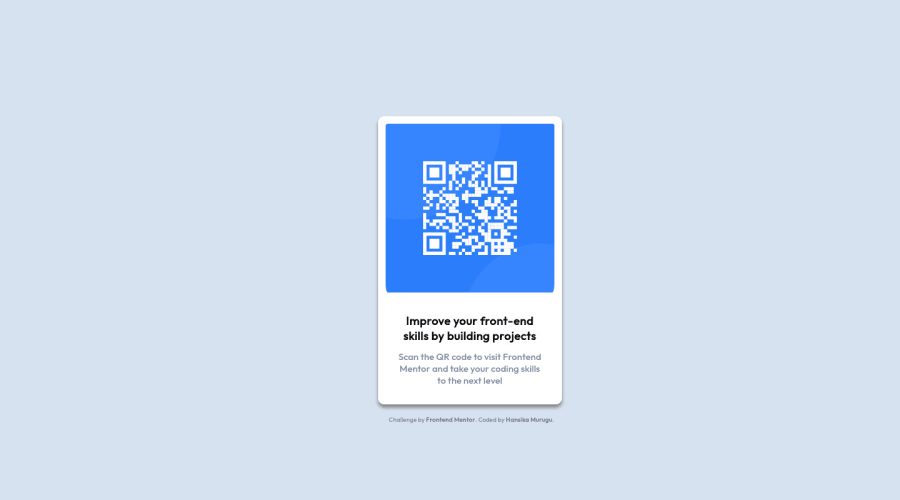
Desktop design screenshot for the QR code component coding challenge

This is a solution for...

  • HTML
  • CSS
1newbie
View challenge

Design comparison


SolutionDesign

Solution retrospective


How do I ensure that my display is responsive across different displays? Even when I add the media query, it doesn't work for me. Any help would be nice!

Community feedback

@victorsonet

Posted

Hey, if you want to make the project responsive I would have few suggestions:

  • If you shrink the page now, the card is moving towards the upper part of the page because you used margins to center the card, another way of doing this (imo its more effective) is using display: flex on your body - now since you have two childs under your body (content and attribution), both will go next to each other because the default flex-direction is row so you want to change that to column. Next thing is you give a min-height: 100vh to the body so it uses the hight of the whole screen and this way you can replace margin-top and left with align-items: center and justify-content: center and you disable the bottom: 30px of .content class.
  • Once you have the previous part, the card becomes bigger then before because there is no margin which cuts off some of the page width and the width: 51% of the .content becomes bigger because the whole page width is bigger, the way you can counter that is you add width: min(20rem, 90%) - this will watch which value is smaller (first is 320px (20*16), second is depending on the page size) and use that width, when you have this property the card width wont change so you have it on all sizes, oh and this way you don't need a media query!
  • Last thing is on the .attribution class, where you defined the padding with % which changes when the page size is changing (so basically 100px's 10% is 10px, 1000px's 10% is 100px) which means it will move if you change the page size, to fix this you could give it padding-top: 2rem and it will stay on the same place.

I tried to be more detailed so it serves you a little bit better and you probably feel overwhelmed by all these things, stay strong and keep going! If there is anything you are unsure of you can just reply and I will try to answer!

0

Please log in to post a comment

Log in with GitHub
Discord logo

Join our Discord community

Join thousands of Frontend Mentor community members taking the challenges, sharing resources, helping each other, and chatting about all things front-end!

Join our Discord