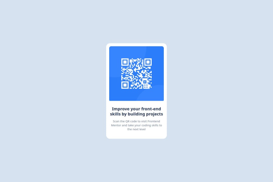
Design comparison
Community feedback
- @correlucasPosted over 2 years ago
👾Hello Nel, congratulations for your solution!
The qrcode card is really well done, but there's some issues related to the element sizes, remember that you can ever use the
comparison sliderto see if your solution is matching the reference.I'll give you some tips:
1.Match the component size using the value
max-width: 350px;.2.Don't use
widthif you expect that the component behave responsive, use evermax-widthto allow the component to scale down horizontally.3.Use
display: block;andmax-width: 100%;to make sure that img* will display 100% ofwidthits inside.Congrats for this solution, I can see that you're improving from the previous challenges.
Hope it helps Nev, happy coding!
0
Please log in to post a comment
Log in with GitHubJoin our Discord community
Join thousands of Frontend Mentor community members taking the challenges, sharing resources, helping each other, and chatting about all things front-end!
Join our Discord
