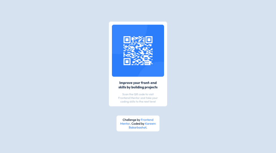
Design comparison
Solution retrospective
what challenge me is to center everything in the center of the page.
Community feedback
- @AbeeujahPosted almost 2 years ago
Hello there 👋. Good job on completing the challenge !
I have some suggestions about your code that might interest you.
HTML 📄:
Use the <main> tag to wrap all the main content of the page instead of the <div> tag. With this semantic element you can improve the accessibility of your page.
Use the <footer> tag to wrap the footer of the page instead of the <div class="attribution">. The <footer> element contains information about the author of the page, the copyright, and other legal information.
Alt text 📷:
Images Should Contain Alt texts for Screen Readers to be able to interpret the Image, you can read more about alt text Here CSS 🎨:
To center the component in the page, you should use Flexbox or Grid layout. You can read more about centering in CSS Here. You should use a CSS reset to remove the default browser styles and make your page look the same in all browsers. Popular CSS resets: Normalize.css Here
Happy coding!
0
Please log in to post a comment
Log in with GitHubJoin our Discord community
Join thousands of Frontend Mentor community members taking the challenges, sharing resources, helping each other, and chatting about all things front-end!
Join our Discord
