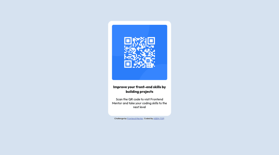
Design comparison
SolutionDesign
Solution retrospective
please write your comment.
Community feedback
- @0xabdulkhaliqPosted almost 2 years ago
REPLY:
- Removing the
.attributionwill provide a nicer look to your project - Qr code component is oversized
RESOLVING THE ISSUE:
- QR component is oversized on screens, which may cause frustation for users
- Resolve this by a quick hack, add
transform: scale(.9);on main component - And remove the
.attributioncontainer to provide good look to project
MESSAGE:
- If my answer helps you then providing an upvote will be very helpfull
- I hope you learned a lot of stuffs during this project, Congrats brother
GREETINGS:
- Peace be upon you with god's mercy & blessings Asem..✨
3 - Removing the
- @AdrianoEscarabotePosted almost 2 years ago
Hi ASEM-TOP, how are you? Welcome to the front-end mentor community! I really liked the result of your project, but I have some tips that I think you will enjoy:
I noticed that in bigger ones the content is going to the side, to solve this we can do the following:
body {
    margin: 0 auto;
}
To improve the code structure wrap this div:
<div class="attribution">with the semantic tag
footerThe rest is great!
I hope it helps... 👍
0
Please log in to post a comment
Log in with GitHubJoin our Discord community
Join thousands of Frontend Mentor community members taking the challenges, sharing resources, helping each other, and chatting about all things front-end!
Join our Discord
