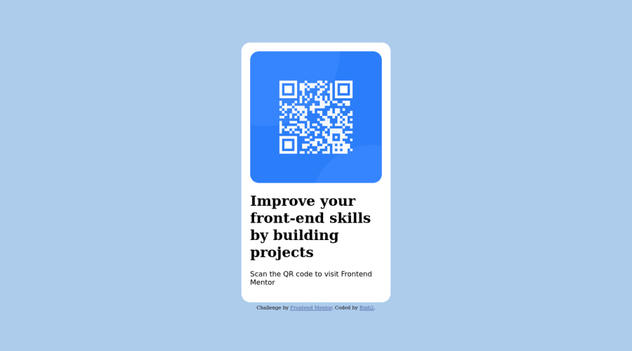
Design comparison
SolutionDesign
Solution retrospective
Any feedback is welcome.
- There are so many way to do one thing (for example: center div, center image in div,...). How do I choose the absolute best to do that one thing? (If you find the question a little confusing, you can message me for more info).
- This is a trivial question so you can ignore it. What social media links should I put in my README.md? (For example: LinkedIn, Twitter, Facebook, Discord, Instagram, Skype, WhatsApp, Zalo, Snapchat, TikTok,...). Btw, I'm using LinkedIn, Twitter in my README.md.
Community feedback
- @HassiaiPosted almost 2 years ago
Replace <div class="container"> with the main tag to fix the accessibility issue.
To center .component on the page, add min-height:100vh; display: flex; align-items: center: justify-content: center; to .container. instead of position: relative and its properties. add text-align center to h1 and p. give h1 and p the same padding left and padding right values. There is no need to give the img a height value. reduce the font-size for h1
Hope am helpful. Happy Coding
Marked as helpful1
Please log in to post a comment
Log in with GitHubJoin our Discord community
Join thousands of Frontend Mentor community members taking the challenges, sharing resources, helping each other, and chatting about all things front-end!
Join our Discord
