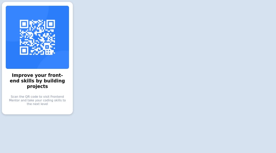
Design comparison
Solution retrospective
I used this to practice better CSS
Community feedback
- @MelvinAguilarPosted almost 2 years ago
Hi there 👋. Good job on completing the challenge !
I have some feedback for you if you want to improve your code.
- Since this component involves scanning the QR code, the image is not a decoration, so it must have an
altattribute. Thealtattribute should explain its purpose. e.g.QR code to frontendmentor.io
- To center the component in the page, you should use Flexbox or Grid layout. You can read more about centering in CSS here. You can read more about centering in CSS here.
body {
    display: grid;
    min-height: 100vh;
    place-content: center;
}
I hope you find it useful! 😄 Above all, the solution you submitted is great!
Happy coding and Happy New Year! 🎉🎊🎁
Marked as helpful2 - Since this component involves scanning the QR code, the image is not a decoration, so it must have an
- @HassiaiPosted almost 2 years ago
Replace<div class="qrcode"> with the main tag, <h2> with <h1> to fix the accessibility issue. click here for more on web-accessibility and semantic html
To center a content on a page, add min-height:100vh; display: flex; align-items: center: justify-content: center; or min-height:100vh; display: grid place-items: center to the body.
Use the colors that were given in the styleguide.md found in the zip folder you downloaded
Use rem or em as unit for the padding, margin, width and preferably rem for the font-size for more on CSS units click here
Hope am helpful.
Well done for completing this challenge. HAPPY CODING
Marked as helpful1@tobezhanabiPosted almost 2 years ago@Hassiai Thank you... I now have a better understanding
0
Please log in to post a comment
Log in with GitHubJoin our Discord community
Join thousands of Frontend Mentor community members taking the challenges, sharing resources, helping each other, and chatting about all things front-end!
Join our Discord
