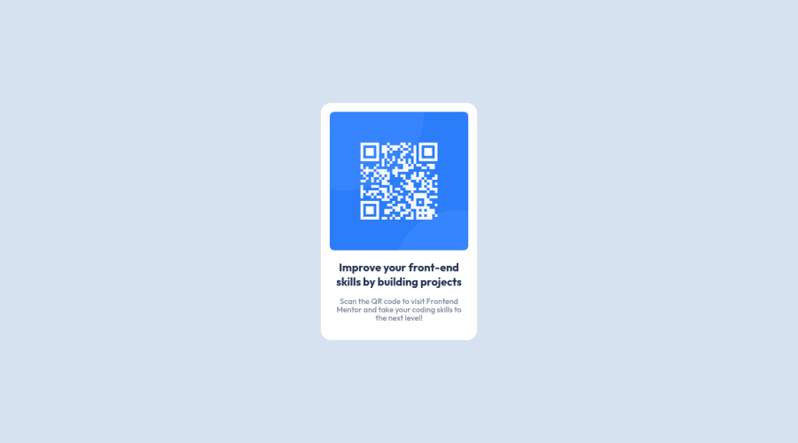
Design comparison
Community feedback
- @MelvinAguilarPosted over 2 years ago
Hi there 👋. Good job on completing the challenge ! I have some feedback for you if you want to improve your code.
HTML:
- Use the
<main>tag to wrap all the main content of the page instead of the<div>tag. With this semantic element you can improve the accessibility of your page.
- The
<br>tag is not a semantic element. If a screen reader user is reading the page, they will hear "line break", which breaks the flow of the content. Instead, use CSS properties likemarginandpaddingto add vertical space between elements.
- The
altattribute should explain the purpose of the image. Uppon scanning the QR code, the user will be redirected to the frontendmentor.io website, so a betteraltattribute would beQR code to frontendmentor.io
If you want to learn more about the
altattribute, you can read this article.CSS:
- Setting the font-size to 62.5% can attract compatibility issues with third-party libraries or plugins. You can read more about this with this two lectures:
Credit to grace-snow and vanzasetia for pointing this out.
- Use
min-height: 100vhinstead ofheight: 100vh. Theheightproperty will not work if the content of the page grows beyond the height of the viewport.
I hope you find it useful! 😄 Above all, the solution you submitted is great!
Happy coding!
Marked as helpful0@Osama-ElshimyPosted over 2 years ago@MelvinAguilar
Thanks a lot. That's very useful.
I really love it when someone gives me feedback. I'm going to work on it soon.
By the way, I'm going to post another solution soon. I'd really appreciate it if you have a look at it.
1 - Use the
Please log in to post a comment
Log in with GitHubJoin our Discord community
Join thousands of Frontend Mentor community members taking the challenges, sharing resources, helping each other, and chatting about all things front-end!
Join our Discord
