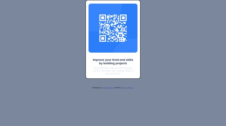
Design comparison
Community feedback
- Account deleted
Hello, I recommend you to remove the edge of the container. Add a margin at the top and bottom of the container of at least 50px and on the sides at zero. You can give a gray color to the paragraph. And give to the attribution class the following values: margin: 10px 0; margin top and bottom 10px. background: white; white background for more visible text. padding: 10px; padding on all sides so that the text is not crowded. font-weight: bold; to make the font thicker.
1 - @Bahbah89Posted about 1 year ago
Hi, congratz on completing this project, good job! If you want to center the card on the page add the following "height" property in the body:
body{ height: 100vh; }
Without height, "align-items" won't have any effect. Hopefully, this was helpful enough, and good luck with your next project!
0
Please log in to post a comment
Log in with GitHubJoin our Discord community
Join thousands of Frontend Mentor community members taking the challenges, sharing resources, helping each other, and chatting about all things front-end!
Join our Discord
