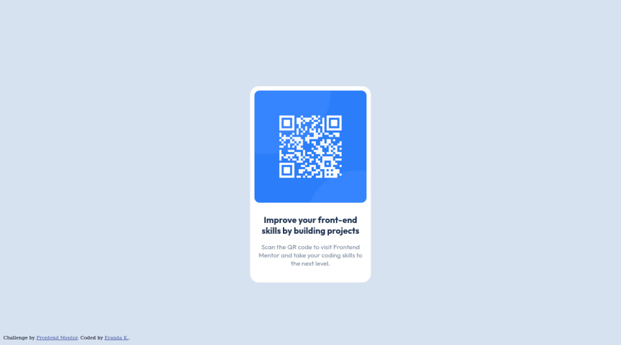
Design comparison
SolutionDesign
Community feedback
- @VCaramesPosted almost 2 years ago
Hey there! 👋 Here are some suggestions to help improve your code:
- The
alt tagdescription for the “QR image” needs to be improved upon. Its needs to tell screen reader users what it is and where it will take them to when they scan it.
- The
attributionneeds to be outside themainand be wrapped inside afooterinstead of adiv.
- Change
widthtomax-widthin your component’s container to make it responsive.
- For improved accessibility 📈 for your content, it is best practice to use
remfor yourfont-sizeand other property value. Using this unit gives users the ability to scale elements up and down, relative to a set value.
If you have any questions or need further clarification, feel free to reach out to me.
Happy Coding!🎄🎁
Marked as helpful1@erandakarachchiPosted almost 2 years ago@vcarames Thanks for the wonderful feedback ❤️
1 - The
Please log in to post a comment
Log in with GitHubJoin our Discord community
Join thousands of Frontend Mentor community members taking the challenges, sharing resources, helping each other, and chatting about all things front-end!
Join our Discord
