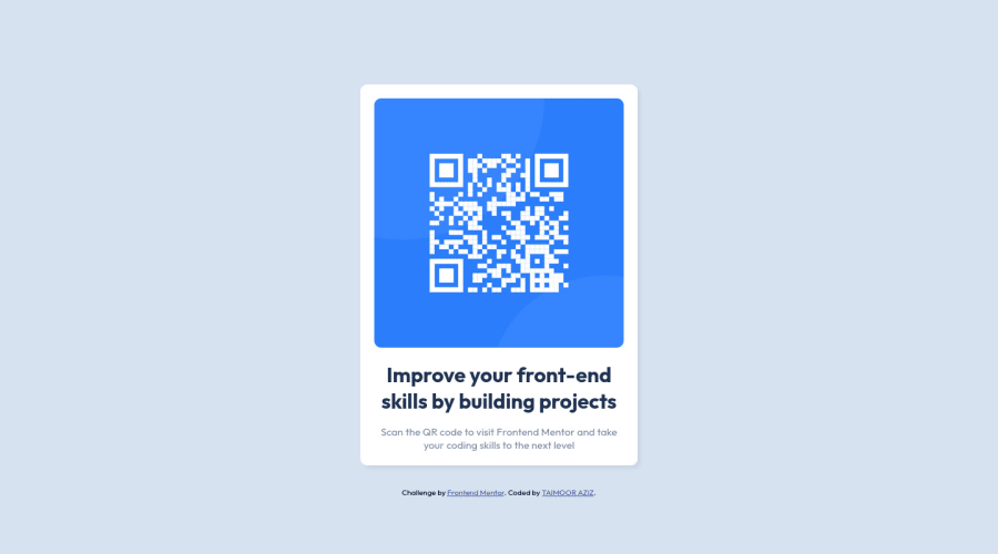
Design comparison
Community feedback
- @HassiaiPosted almost 2 years ago
Replace<div class="container">with the main tag and <div class="attribution"> with the footer tag to fix the accessibility issues. click here for more on web-accessibility and semantic html
To center .container on the page replace the height in the body with min-height.
Give the alt attribute a value so that those using assistive technology like screen readers would know of the image. the value of the alt is the description of the image.
Give h1 and p the same font-size of 0.9375rem which is 15px, the same margin-left and right value. Give p a margin-bottom value and add a margin-top value to h1.
For a responsive content which wont require a media query for this challenge give .container a fixed max-width value.
max-width: 20remand img a max-width of 100%.Hope am helpful.
Well done for completing this challenge. HAPPY CODING
Marked as helpful1 - @MohmedElshaarawyPosted almost 2 years ago
Hi, Taimoor Aziz Good job on completing the challenge!
I have some suggestions about your code that might interest you.
HTML
Use the <main> tag to wrap up all the main content of the page instead of the <div> tag. With this semantic element, you can improve the accessibility of your page. Use the <footer> tag to wrap the footer of the page instead of the <div class="attribution">. The <footer> element contains information about the author of the page, the copyright, and other legal information. Since this component involves scanning the QR code, the image is not a decoration, so it must have an alt attribute. The alt attribute should explain its purpose. e.g. QR code to frontendmentor.io CSS
Instead of using pixels in font size, use relative units like em or rem. The font size in absolute units like pixels does not scale with the user's browser settings. This can cause accessibility issues for users who have set their browser to use a larger font size. You can read more about this here. Use min-height: 100vh instead of height: 100vh. The height property will not work if the content of the page grows beyond the height of the viewport. I hope you find it useful!
Happy coding❤️
0 - @MelvinAguilarPosted almost 2 years ago
Hello there 👋. Good job on completing the challenge !
I have some suggestions about your code that might interest you.
Alt text 📷:
- The
altattribute should not contain underscores or hyphens, it must be human readable and understandable.
-
The
altattribute should explain the purpose of the image. Uppon scanning the QR code, the user will be redirected to the frontendmentor.io website, so a betteraltattribute would beQR code to frontendmentor.ioIf you want to learn more about the
altattribute, you can read this article. 📘.
CSS 🎨:
-
Using
height: 100vhorheight: calc(100vh - 1px);for the body element can cause problems with the layout of the page on smaller screens, such as in landscape view on a mobile device.On smaller screens, such as in landscape view on a mobile device, the height of the viewport may be less than the height of the content of the page. In this case, using height: 100vh for the body element will cause the content of the page to be hidden behind the body element.
Here is an image of how it would look on a mobile device (taking into account the scroll): screencapture-tamis-qr-code-component-netlify-app
To avoid this problem, it is generally recommended to use
min-height: 100vhinstead ofheight: 100vhfor the body element. This will ensure that the content of the page is always visible.
I hope you find it useful! 😄 Above all, the solution you submitted is great!
Happy coding!
0 - The
Please log in to post a comment
Log in with GitHubJoin our Discord community
Join thousands of Frontend Mentor community members taking the challenges, sharing resources, helping each other, and chatting about all things front-end!
Join our Discord
