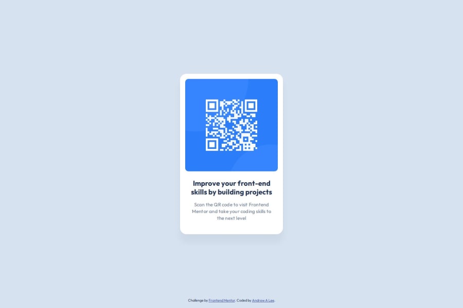
Design comparison
Solution retrospective
I was pleasantly surprised at the ease that CSS Flexbox allows for laying out elements. I transitioned away from web development right around the time when Flexbox and Grid were becoming standardized. I'm mostly familiar with the excruciating pain points and hacks we web developers endured before these modern layout techniques were available. I'm glad those are now a past relic and am proud of having learned how to leverage Flexbox sufficiently. I'm still in the process of catching up with modern CSS methodologies and would incorporate more of these best practices on my next project.
What challenges did you encounter, and how did you overcome them?The biggest pain points were encountered with setting up the project with NPM and Github. I wanted sufficient safeguards for my projects and have included Prettier, ESLint, and Stylelint for HTML, CSS, and JS checks. In particular, the ESLint configuration setup has recently changed to a "flat" configuration, which took some time to determine the optimal setup for. I overcame the issues mostly with trial and error and by inspecting the config objects as well as by leveraging the CLI --inspect-config tool.
Mostly ensuring that I am following modern conventions and best practices for authoring HTML and CSS code.
Community feedback
- @AMarazaPosted 27 days ago
Overall this is a very clean and accurate result with not much to critique.
I might suggest using more combinators within your style sheet instead of relying solely on class elements.
For example:
.qr-card-container pwould target every paragraph within your qr card container. Or you could write.qr-card-container .qr-card-captionto specifically target everything with the class qr-card-caption within qr-card-container.0
Please log in to post a comment
Log in with GitHubJoin our Discord community
Join thousands of Frontend Mentor community members taking the challenges, sharing resources, helping each other, and chatting about all things front-end!
Join our Discord
