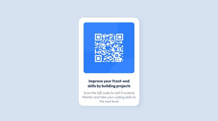
Design comparison
Solution retrospective
Hello this is my second attempt on this challenge. I redid this from scratch because the first time I did not fully understand what I was doing. Now I have a better understanding of some concepts so I came back to try this again. Any feedbacks and comments are welcome so I can't wait to see your opinion about what I did. Thanks a lot :)
Community feedback
- @correlucasPosted about 2 years ago
👾Hi @yuki6464, congratulations on your solution!
Great solution and a great start! From what I saw you’re on the right track. I’ve few suggestions for you that you can consider adding to your code:
1.I saw that for some properties you’ve used
remand for otherspx. In this case, it is better to use only one kind of unit to have a better organization for your code.relative unitsasremoremhave a better fit if you want your site more accessible between different screen sizes and devices.REMandEMdoes not just apply to font size, but to all sizes as well.2.Add the website favicon inserting the svg image inside the
<head>.<link rel="icon" type="image/x-icon" href="./images/favicon-32x32.png">Here's my solution for this challenge if you wants to see how I build it: https://www.frontendmentor.io/solutions/qr-code-component-vanilla-cs-js-darklight-mode-nS2aOYYsJR
✌️ I hope this helps you and happy coding!
Marked as helpful1
Please log in to post a comment
Log in with GitHubJoin our Discord community
Join thousands of Frontend Mentor community members taking the challenges, sharing resources, helping each other, and chatting about all things front-end!
Join our Discord
