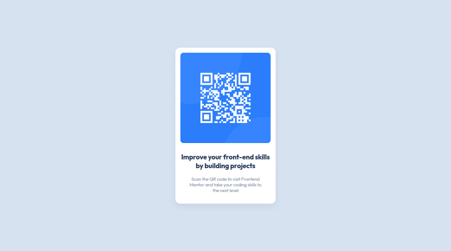
Design comparison
Community feedback
- @frank-itachiPosted about 2 years ago
Hello there 👋. You did a good job!
I have some suggestions about your code that might interest you.
HTML 📄:
- Wrap the page's whole main content in the
<main>tag.
CSS🎨:
You can use grid or flexbox to center the content no matter the viewport size. Since I use grid to achieve such purpose, you can do the following:
body {
	min-height: 100vh;
        display: grid;
	align-items: center;
	justify-content: center;
}
As I said, you can use flexbox to center the content and it will work as well.
body { min-height: 100vh; display: flex; align-items: center; justify-content: center; }- Avoid using absolute length units px, especially for font-size and width properties, because they are not relative to anything else so that means they will always be the same size. Instead, you can use relative lengths like em or rem. The benefit of that last one is element which has that unit will scale relatively to everything else within the page, e.g., the parent container. You can dig up about it here
I hope you find it useful! 😁😁 Above all, the solution you submitted is great👌!
Happy
<coding />😎!Marked as helpful0@bundassePosted about 2 years ago@frank-itachi Thanks for your comment! This time I choose transform because of CSS flex IE issues, but I consider coding with CSS flex or grid next time! And comment about px units is really helpful! thx😄
0 - Wrap the page's whole main content in the
Please log in to post a comment
Log in with GitHubJoin our Discord community
Join thousands of Frontend Mentor community members taking the challenges, sharing resources, helping each other, and chatting about all things front-end!
Join our Discord
