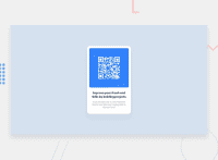
Design comparison
Solution retrospective
1--> Why the image is not coming in the page? 2--> How can i make my qr image border round and small? 3--> Why is not positioning at the center of the screen 4--> What should i do for best practice. 5--> Please provide your genuine feedback where should i improve?
Thanks in advance
Community feedback
- @correlucasPosted about 2 years ago
👾Hello , congratulations for your first solution! 👋 Welcome to the Frontend Mentor Coding Community!
Here's some tips to improve your solution:
1.Add the correct size to avoid the container growing more than it should. In this case the QR CODE component size is
max-width: 320px.2.You’ve used
<div>to wrap the card container, in this case you need to use<main>since this is the main block of this page.3.Every page needs a main heading, the
<h1>to show which is the most important heading. You need to increase the headings by one level, like h1, h2, h3 to show the titles hierarchy. Remember that you cannot have more than one h1 heading.4.The html structure can be reduced by removing unnecessary divs, all you need is a single
<main>or<div>to keep all the content inside, and nothing more. The ideal structure is thedivand only the image, heading and paragraph.✌️ I hope this helps you and happy coding!
Marked as helpful0@IAmFardeenPosted about 2 years ago@correlucas Thank You So much for your valuable feedback, I will keep this in mind for the next challenge .
Thanks!
0 - @romila2003Posted about 2 years ago
Hi Fardeen,
Congratulations 🎉 for completing this challenge, the card looks great and is functional however I found some issues I want to address:
- It is best practice to wrap the main content within the
maintag which would ensure that your content is wrapped within the correct landmarks e.g.<main class="container"></main> - You should also wrap the footer within the
footertag e.g.<footer class="attribution"></footer> - Since this card does not heavily rely on responsiveness, I would recommend you using a fixed value for the width of the card e.g.
max-width: 300px; - To give the image, rounded corners, you can use the
border-radiusproperty on the image, like you did for your card. - Your texts are missing the correct
font-family,font-weightandcolorwhich can all be found in the style-guide. - Instead of using the
positionproperty ofabsolute, you can use theflexproperty to center the card e.g.
body {
  display: flex;
  align-items: center;
  justify-content: center;
  min-height: 100vh;
}
Overall, great attempt and wish you the best for your future projects so keep coding 👍.
Marked as helpful0@IAmFardeenPosted about 2 years ago@romila2003 Thank you so much, I really appreciate it, I took your suggestion and also updated on my local code , it's perfectly working. would always like to get feedback from your side.
1 - It is best practice to wrap the main content within the
Please log in to post a comment
Log in with GitHubJoin our Discord community
Join thousands of Frontend Mentor community members taking the challenges, sharing resources, helping each other, and chatting about all things front-end!
Join our Discord

