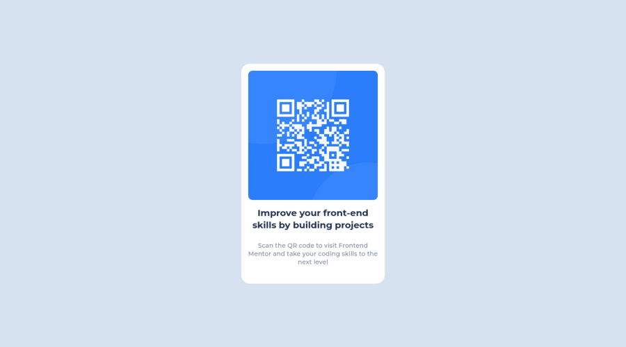
Design comparison
Solution retrospective
Producing this pixel-perfect development without designs.
What challenges did you encounter, and how did you overcome them?This was fairly straightforward however, the most interesting aspect was aligning the design in the middle of the page.
What specific areas of your project would you like help with?None
Community feedback
- @MelvinAguilarPosted almost 2 years ago
Hello there π. Good job on completing the challenge !
I have some suggestions about your code that might interest you.
HTML π:
- In this challenge, the picture tag is not needed, since the image does not need to change depending on the viewport. This is necessary when the platform provides two images, one for mobile and one for desktop. You can directly use the image tag in this solution.
Alt text π·:
- The
alt
attribute should not contain the words "image", "photo", or "picture", because the image tag already conveys that information.
-
The
alt
attribute should explain the purpose of the image. Uppon scanning the QR code, the user will be redirected to the frontendmentor.io website, so a betteralt
attribute would beQR code to frontendmentor.io
If you want to learn more about the
alt
attribute, you can read this article. π.
CSS π¨:
- Instead of using pixels in font-size, use relative units like
em
orrem
. The font-size in absolute units like pixels does not scale with the user's browser settings. This can cause accessibility issues for users who have set their browser to use a larger font size. You can read more about this here π.
I hope you find it useful! π Above all, the solution you submitted is great!
Happy coding!
Marked as helpful1@lawlawsonPosted almost 2 years ago@MelvinAguilar Wow, thank you so much for the detailed feedback, very kind of you! I'll be sure to read the links you have sent to me and implement the suggested changes to further my understanding.
0 - @HassiaiPosted almost 2 years ago
To center .container on the page using flexbox, replace the height in the body with min-height: 100vh.
give the img a max-width of 100% instead a width and height value.
Use relative units like rem or em as unit for the padding, margin, width values and preferably rem for the font-size values, instead of using px which is an absolute unit. For more on CSS units Click here
Hope am helpful.
Well done for completing this challenge. HAPPY CODING
Marked as helpful0@lawlawsonPosted almost 2 years ago@Hassiai thank you for the feedback and sharing the link to the video, super helpful in my learning journey.
1
Please log in to post a comment
Log in with GitHubJoin our Discord community
Join thousands of Frontend Mentor community members taking the challenges, sharing resources, helping each other, and chatting about all things front-end!
Join our Discord