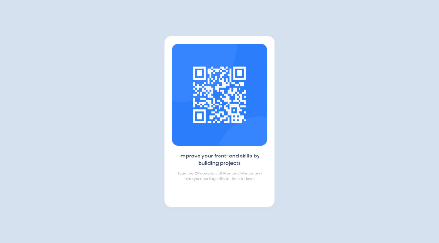
Design comparison
Solution retrospective
How did you solve this problem?
Community feedback
- @MohmedElshaarawyPosted almost 2 years ago
Hi, Sávio Tito Good job on completing the challenge!
I have some suggestions about your code that might interest you.
HTML
Use the <main> tag to wrap up all the main content of the page instead of the <div> tag. With this semantic element, you can improve the accessibility of your page. Use the <footer> tag to wrap the footer of the page instead of the <div class="attribution">. The <footer> element contains information about the author of the page, the copyright, and other legal information. Since this component involves scanning the QR code, the image is not a decoration, so it must have an alt attribute. The alt attribute should explain its purpose. e.g. QR code to frontendmentor.io CSS
Instead of using pixels in font size, use relative units like em or rem. The font size in absolute units like pixels does not scale with the user's browser settings. This can cause accessibility issues for users who have set their browser to use a larger font size. You can read more about this here. Use min-height: 100vh instead of height: 100vh. The height property will not work if the content of the page grows beyond the height of the viewport. I hope you find it useful!
Happy coding❤️
0@SavioTitoPosted almost 2 years ago@MohmedElshaarawy, obrigado por reelembrar, amigo! 👋🏽
0
Please log in to post a comment
Log in with GitHubJoin our Discord community
Join thousands of Frontend Mentor community members taking the challenges, sharing resources, helping each other, and chatting about all things front-end!
Join our Discord
