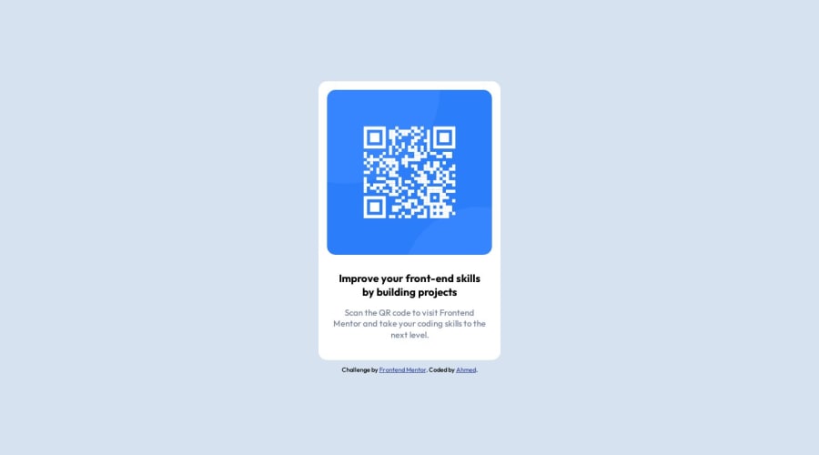
Design comparison
Solution retrospective
I hope you like what I did and I'm open for any feedback
Community feedback
- @Aimal-125Posted almost 2 years ago
In your CSS code, increase the height of body element to 120 or 150vh by using media query with
max-height: 400px;so that your solution look good on screens with small heights.Marked as helpful1@ahmed-abbePosted almost 2 years ago@Aimal-125 Thanks! so I should add this to my current code right? @meida (max-height: 400px) { body { min-height: 150vh; } }
0 - @0xabdulkhaliqPosted almost 2 years ago
Hello there 👋. Congratulations on successfully completing the challenge! 🎉
- I have other recommendations regarding your code that I believe will be of great interest to you.
QR iMAGE ALT TEXT 📸:
- The QR Code Component involves scanning the QR code, the image is not a decoration, so it must have an
altattribute which should explain the purpose of theimage.
- The
altwithQR Codeis not even explaining for what the QR image need to be used.
- So update the
altwith meaningful text which explains likeQR code to frontendmentor.io
- Example:
<img src="/images/image-qr-code.png" alt="QR code to frontendmentor.io">
.
I hope you find this helpful 😄 Above all, the solution you submitted is great !
Happy coding!
Marked as helpful1@ahmed-abbePosted almost 2 years ago@0xAbdulKhalid Thanks! I will update my code and take that into account next time I'm coding. Happy coding to you too!
0
Please log in to post a comment
Log in with GitHubJoin our Discord community
Join thousands of Frontend Mentor community members taking the challenges, sharing resources, helping each other, and chatting about all things front-end!
Join our Discord
