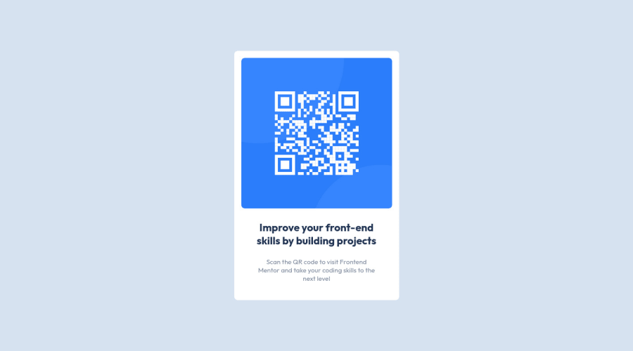
Design comparison
Solution retrospective
Basic QR Code component using CSS Flexbox
Community feedback
- @HassiaiPosted almost 2 years ago
Replace <section> with the main tag and <p class="header"> with <h1> to fix the accessibility issues. click here for more on web-accessibility and semantic html
To center .con on the page using flexbox, replace the height in the body with min-height:100vh.
for a responsive content, replace the width of .con with max-width value to prevent the content from covering the entire screen withe size of 375px.
Use relative units like rem or em as unit for the padding, margin, width values and preferably rem for the font-size values, instead of using px which is an absolute unit. For more on CSS units Click here
Hope am helpful.
Well done for completing this challenge. HAPPY CODING
Marked as helpful0 - @superpooperxxxPosted almost 2 years ago
Hello, Julius, good job. Small fixes could be added to improve your code.
You have an empty alt attribute on <img>, this is a bad practice for search engines. Add something like alt="QR code to go to frontendmentor.io". Also get rid of srcset="", cause you are not using any alternative path to image.
<img src="images/image-qr-code.png" alt="" srcset="">Also to improve semantic use some heading tag here, for example <h1>
<p class="header">Improve your front-end skills by building projects</p>Marked as helpful0
Please log in to post a comment
Log in with GitHubJoin our Discord community
Join thousands of Frontend Mentor community members taking the challenges, sharing resources, helping each other, and chatting about all things front-end!
Join our Discord
