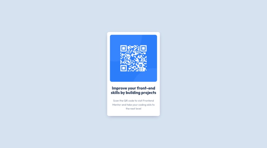
Design comparison
SolutionDesign
Community feedback
- @grace-snowPosted almost 2 years ago
Looks good! Just some minor points to note
- you've forgotten to close main
- I don't think the div wrapping h1 and p is necessary
- you're not using the font size defined in the style guide (0.9rem is not equivalent to 15 px)
- give the card a little margin or a wrapper a little padding so the component can't touch screen edges. It's touching at top and bottom of the screen on my mobile
1@Bilel-mwihbiPosted almost 2 years agoHi @grace-snow thank you so much for replying 😄
My question is when should I wrap elements with div ?
thank you for considering my request 😊
0
Please log in to post a comment
Log in with GitHubJoin our Discord community
Join thousands of Frontend Mentor community members taking the challenges, sharing resources, helping each other, and chatting about all things front-end!
Join our Discord
