Not Found
Not Found
Not Found
Not Found
Not Found
Not Found
Not Found
Not Found
Not Found
Not Found
Not Found
Not Found
Not Found
Not Found
Not Found
Not Found
Not Found
Not Found
Not Found
Not Found

Submitted

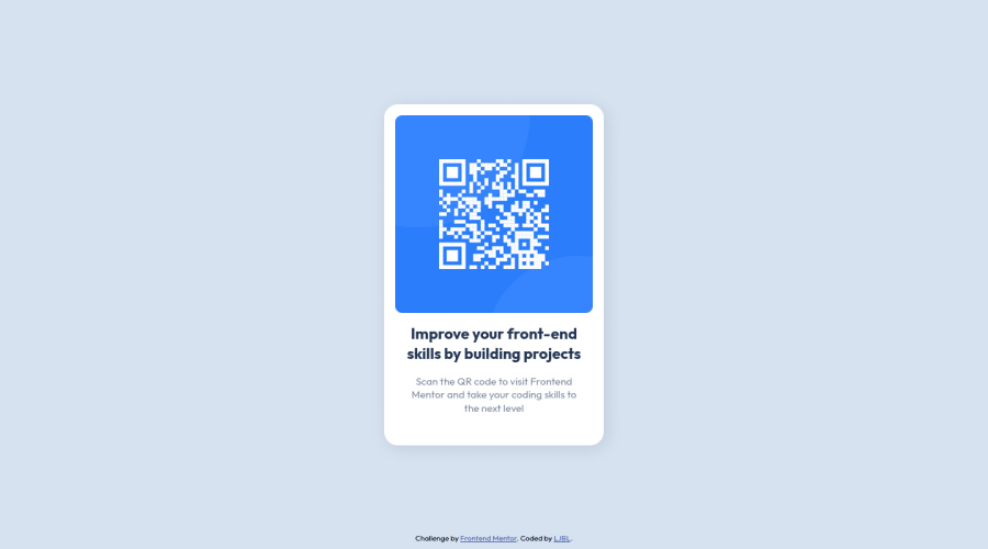
*use :root to store all the colors; *CSS reset; *basic HTML & CSS

P
LJBL 200

@LJBL22

Desktop design screenshot for the QR code component coding challenge

This is a solution for...

  • HTML
  • CSS
1newbie
View challenge

Design comparison


SolutionDesign

Solution retrospective


Hi everyone,

My name is LJBL, I'm so happy and excited to finish my first challenge in Frontend Mentor, though it did take me more time than I thought.

I have two questions below, and feel free to answer either of them, I appreciate it ^^!

  • I wonder how to avoid when users zoom-in their browsers and the format of text/paragraph going off. In this case, I assume FEM want all the text fix on the card, right? I asked because it's funny that I incidentally zoomed in my browser to 90% while I was coding..., luckily I found out before I submitting the work! I struggled like for an hour to check where went wrong lol.

  • Every time when I try to place an image, I just not sure which to choose the better, the property background-image , or a <img> ? Which do you prefer, or in which condition will you choose to use?

Thank you for your time :^D Happy coding!

Community feedback

Alamin 2,000

@CodePapa360

Posted

Hi LJBL👋 Great job on completing this challenge! 🥳

I would like to share a few suggestions on this solution if you don't mind.

To prevent text from breaking out of its container when the page is zoomed in, you can use the overflow-wrap property in your CSS. The overflow-wrap property allows you to specify whether or not the browser should insert line breaks within words to prevent text from overflowing its container.

In this case, you've already set the overflow-wrap property to break-word for the h1 and p elements, which will cause the browser to insert line breaks within words to prevent text from overflowing its container. This should help to keep the text within the card when the page is zoomed in.

Here's an example of how you could use the overflow-wrap property in your CSS:

p, h1 {
  overflow-wrap: break-word;
}

Alternatively, you could use the word-wrap property, which has the same effect as overflow-wrap.

p, h1 {
  word-wrap: break-word;
}

Answering your second question: Both the background-image property and the <img> element can be used to display images on a web page. However, they are used in different ways and are suitable for different use cases.

The background-image property is used to set an image as the background of an element. It is applied to a specific element using CSS, and the image is displayed behind any other content within the element. Here's an example of how you can use the background-image property in your CSS:

body {
  background-image: url('/path/to/image.jpg');
}

The <img> element is used to embed an image in an HTML document. It is inserted directly into the HTML code and is treated as a standalone element that can be positioned and styled using CSS. Here's an example of how you can use the <img> element in your HTML:

<img src="/path/to/image.jpg" alt="Description of image">

In general, you should use the <img> element when you want to display an image as part of the content of your page, and use the background-image property when you want to use an image as a design element or to provide a background for an element. However, there are no hard and fast rules, and you can use either approach depending on your specific needs and design goals.

Overall, this is a very well done solution to the challenge. Great job!

I hope this feedback was helpful. 😊 Keep up the good work!👍

Marked as helpful

1

P
LJBL 200

@LJBL22

Posted

Hi @CodePapa360

Thank you so much for the encouragement and advice! They are super helpful and concepts are well delivered! I hope I can deliver my thoughts as good as you do soon :D To achieve that, I will keep practice for sure.

Regarding my first question, receiving your suggestions, I checked again, and found an interesting result which I can feel but hard to explain at this stage. Only FireFox zoom in will go out of control!! I use Mac, and when I use my touch panel to zoom-in & zoom-out, it all went well on chrome, edge, FireFox. However, if I chose to click the zoom-in on setting panel, all went perfect except FireFox. How interesting!

0

Please log in to post a comment

Log in with GitHub
Discord logo

Join our Discord community

Join thousands of Frontend Mentor community members taking the challenges, sharing resources, helping each other, and chatting about all things front-end!

Join our Discord