

Design comparison
SolutionDesign

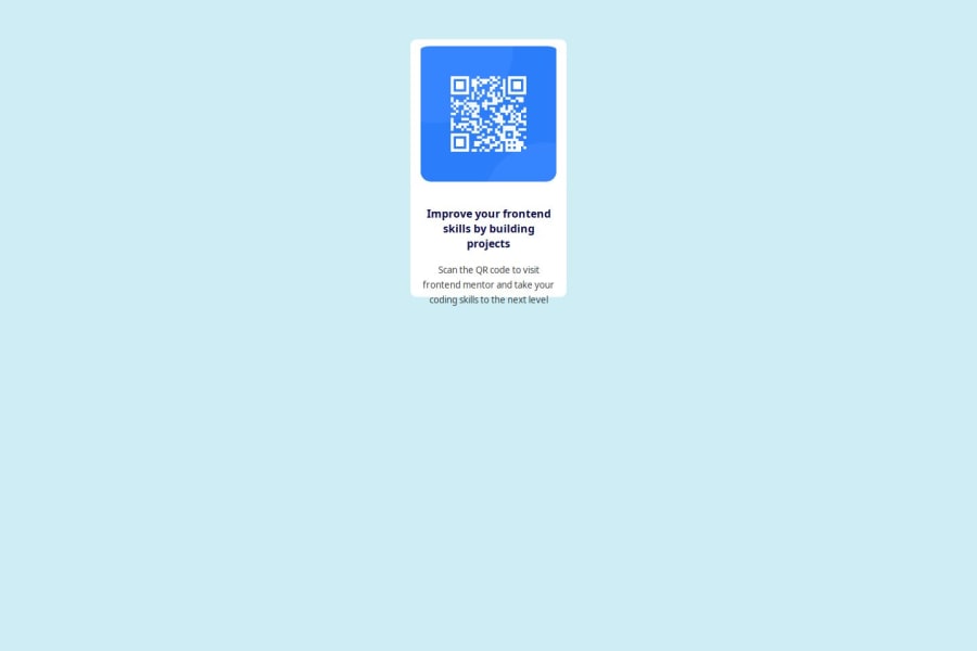
Solution retrospective
What are you most proud of, and what would you do differently next time?
I completed the task
What challenges did you encounter, and how did you overcome them?Hosting i researched
What specific areas of your project would you like help with?I dont know yet
Community feedback
- @BledanITPosted 5 months ago
The code is very short and condensed, which is a plus since it reflects optimization and readability. However I'm seeing two problems:
- The card is placed at the beginning of the pace, while the assignment shows it in the center. This can be done through CSS by adding to the card rules "position:absolute, top: 50%, left: 50%" and "transform: translateX(-50%) translateY(-50%)".
- The text overflows beyond the card's borders. this might be doable by adding a CSS rule "max-height: fit-content" to the card.
0

Please log in to post a comment
Log in with GitHubJoin our Discord community
Join thousands of Frontend Mentor community members taking the challenges, sharing resources, helping each other, and chatting about all things front-end!
Join our Discord