

Design comparison
SolutionDesign

Solution retrospective
What are you most proud of, and what would you do differently next time?
- Figuring out how adjust font-weight with Google variable fonts.
- Adding images to my site and getting them to load.
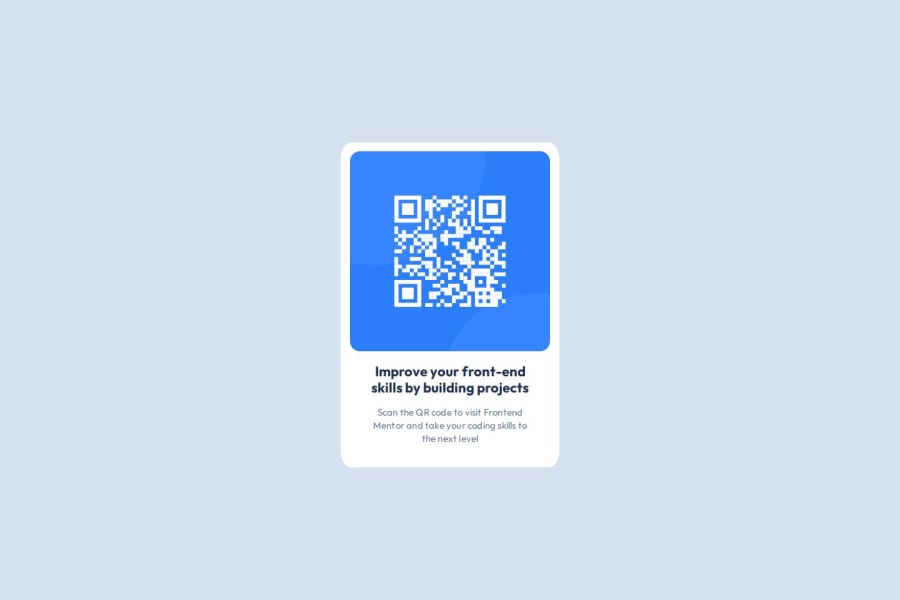
- Vertically aligning the QR code section.
- Horizontally aligning the QR code section.
- Implementing flexbox.
- Finding the correct adjustments for the box shadow of the QR code section.
- Adjustments for the box shadow (the one I inserted does not look as subtle as the one in the example).
Community feedback
Please log in to post a comment
Log in with GitHub
Join our Discord community
Join thousands of Frontend Mentor community members taking the challenges, sharing resources, helping each other, and chatting about all things front-end!
Join our Discord