Design comparison
Solution retrospective
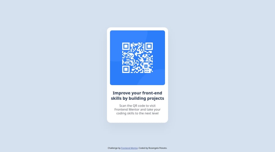
I'm proud of my solution because Its very similar to what the design wanted and it didn't break on my responsive tests.
What challenges did you encounter, and how did you overcome them?- Responsibility is a recurring theme that always bothers me, although the project is simple, it taught me a few things about this subject.
- Figma desktop is a big mystery to me, I always worked in the web version and did pretty good, but this time I felt lost especially about the typography.
Visually my project is good, but if I can improve my code please let me know. I would like to thank everyone in advance for taking the time to review and write a feedback.
Community feedback
- @Aiswariya3aPosted 11 months ago
Feedback
- Yes, The solution include semantic HTML.
- Could have added a shadow effect to make it more similar to the original design. Other than that, everything seems good.
- I couldn't see any break in the webpage while checking for other screen sizes.
- Yes, the code is clear with a separate styling file.
- No, the solution seems very similar to the design.
Improvements
- Consider adding a shadow effect to match the original design more closely.
- Use ARIA roles where necessary to improve accessibility further.
Marked as helpful0@RozangelaPeixotoPosted 11 months ago@Aiswariya3a thanks for your feedback. I'll look into the ARIA roles, I didn't know about that. And the shadow effect, I really miss it, I'll fix it right away.
1 - @dieherramPosted 11 months ago
Congratulations, I liked the inclusion of Google Lighthouse to measure accessibility and good practices in your code. I will definitely start using it 😀.
Seeing your solution led me to implement improvements in my original solution, I had not considered the Figma file 🙃.
1
Please log in to post a comment
Log in with GitHubJoin our Discord community
Join thousands of Frontend Mentor community members taking the challenges, sharing resources, helping each other, and chatting about all things front-end!
Join our Discord
