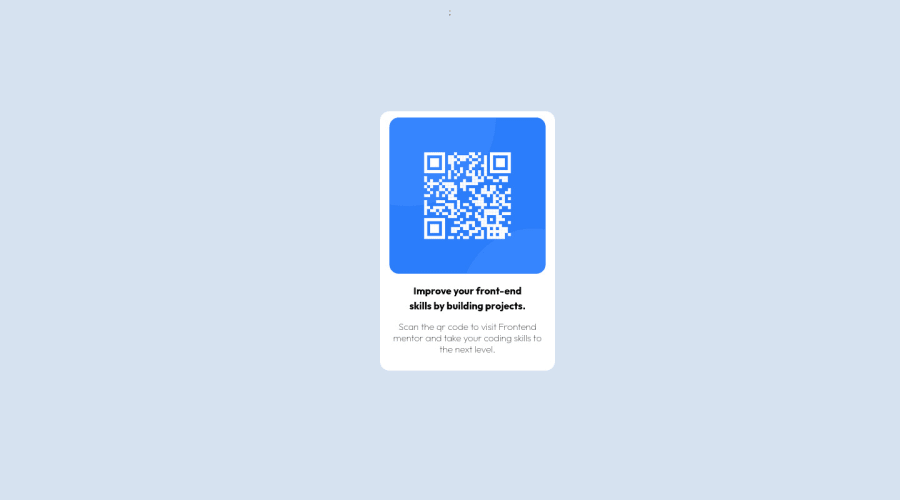
Design comparison
Solution retrospective
It was a fun to make it.
Community feedback
- @MohmedElshaarawyPosted almost 2 years ago
Hi, Swapnil Pandey Good job on completing the challenge!
I have some suggestions about your code that might interest you.
HTML
Use the <main> tag to wrap up all the main content of the page instead of the <div> tag. With this semantic element, you can improve the accessibility of your page. Use the <footer> tag to wrap the footer of the page instead of the <div class="attribution">. The <footer> element contains information about the author of the page, the copyright, and other legal information. Since this component involves scanning the QR code, the image is not a decoration, so it must have an alt attribute. The alt attribute should explain its purpose. e.g. QR code to frontendmentor.io CSS
Instead of using pixels in font size, use relative units like em or rem. The font size in absolute units like pixels does not scale with the user's browser settings. This can cause accessibility issues for users who have set their browser to use a larger font size. You can read more about this here. Use min-height: 100vh instead of height: 100vh. The height property will not work if the content of the page grows beyond the height of the viewport. I hope you find it useful!
Happy coding❤️
Marked as helpful0 - @catherineisonlinePosted almost 2 years ago
HI! Your solution looks nice though there are a couple of things you can improve which I hope will be helpful! 😊
First fo all you need to have a heading, h1 in this case. You should not use only p tags everywhere.
<h1>Improve your front-end skills by building projects.</h1>To separate them there are different ways but you can just use <br> (break) for example between the text. I usually just add padding and the text moves itself.
Also, make sure to wrap the entire code in the main tag, so outside div where the class is “div” add <main> tag. It will help to remove report issues and improve accessibility as well. If you are using, for example, header or footer tags, you can place them outside the main tag.
And also to center your div with the class "div" add and remove this margin-left.
margin: 0 auto;
``
0 - @vabel17Posted almost 2 years ago
Can't view your code! You might have mispelled the link.
Other than that, your content is not centered properly. You have moved it to a fixed place by margins and it will stay there on other viewports too. For this particular project it is fine to use:
body { display: flex; justify-content: center; align-items: center }However, there are many other ways to do it.
0
Please log in to post a comment
Log in with GitHubJoin our Discord community
Join thousands of Frontend Mentor community members taking the challenges, sharing resources, helping each other, and chatting about all things front-end!
Join our Discord
