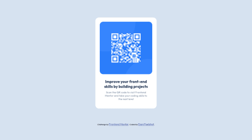
Design comparison
Solution retrospective
I have done the exercise again, taking into account variables such as the use of sass and best practices in html.
Community feedback
- @caarlosdamianPosted almost 2 years ago
Hola Dani Felicidades por tu solucion espero ayudar con mis comentarios , usar scss excelente me encanto ese detalle
- Utiliza en tu reset de *{}
box-sizing:border-box
esto ayudara a que el padding y el contenido se sume para tener medidas mas exactas , puedes ver que tu card es un poco mas grande a la del diseno original. Puedes ver mas al respecto en box-sizing - Puedes borrar
<header></header>
si no tiene contenido no hay problema.
Aun asi EXCELENTE TRABAJO sigue asi !
Marked as helpful2@FeelshotPosted almost 2 years ago@caarlosdamian Hola Carlos, gracias por tus comentarios, me son de mucha ayuda, lo implementaré en este y futuros ejercicios 🤩
0 - Utiliza en tu reset de *{}
- @Deevyn9Posted almost 2 years ago
Hi Dani, congrats on completing this project, your solution looks really good, however, you'll need to use
max-width
instead ofwidth
to make the container more responsive for smaller screens, you'll also need to add paddings to the left and right of the body to give it a bit of space from the container when it goes below the specifiedmax-width
.I hope this is helpful to you.
Happy Coding!🎉
Marked as helpful1@FeelshotPosted almost 2 years agoHello @Deevyn9 thank you very much for your comments, it certainly helps me to have a different perspective, I will implement it without a doubt.
1
Please log in to post a comment
Log in with GitHubJoin our Discord community
Join thousands of Frontend Mentor community members taking the challenges, sharing resources, helping each other, and chatting about all things front-end!
Join our Discord