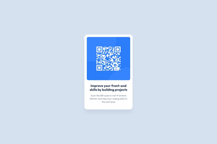
Design comparison
Community feedback
- @Pedro-CelestePosted almost 2 years ago
Hey dude! Congratulations on finishing this code challenge!! 😎👍🏻
Here's some feedback on how you cand improve you code:
HTML:
-
Instead of using
<div class="card">, you should use a<main>tag instead. This improves accessibility fo people who uses screen readers. I use it myself some times and it really makes a difference. -
Add an alternative text to your image using the
altattribute in the<img>element. This provides a piece of text describing an image to those using an screen reader. For examplealt="A QR code that leads to the Frontend Mentor website". You can learn more about the alt attribute here. -
Every page with headings should start with an
<h1>element. You can change the<h2>in the source code to fix this.
CSS:
-
Your CSS is great, you only forgot to add the
--dark-blue: hsl(218, 44%, 22%);color to the<h1>element. It might be subtle but it's not complete black. -
If you notice in the original design, there is a slight
box-shadowbelow the main container. Tip: convert the light gray color to rgb and use rgba to define an opacity value to make the shadow weaker.
That's it!! Keep up with the good work and have a nice day!!
Marked as helpful0 -
Please log in to post a comment
Log in with GitHubJoin our Discord community
Join thousands of Frontend Mentor community members taking the challenges, sharing resources, helping each other, and chatting about all things front-end!
Join our Discord
