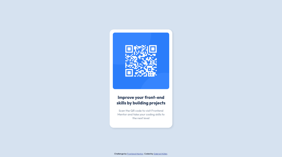
Design comparison
SolutionDesign
Solution retrospective
Hello, everyone.
Any feedback are welcome, more specific about best practices.
Community feedback
- @MelvinAguilarPosted almost 2 years ago
Hello there 👋. Good job on completing the challenge !
I have some feedback for you if you want to improve your code.
HTML 📄:
- In my opinion, the
<section class="main section">element is unnecessary, because you can place all its styles directly in the body element and have the same result.
- Use the
<main>tag to wrap all the main content of the page instead of the<div class="main-container">tag. With this semantic element you can improve the accessibility of your page.
- Since this component involves scanning the QR code, the image is not a decoration, so it must have an
altattribute. Thealtattribute should explain its purpose. e.g.QR code to frontendmentor.io
CSS 🎨:
- Setting the font-size to 62.5% can attract compatibility issues with third-party libraries or plugins. You can read more about this with this two lectures:
Credit to grace-snow and vanzasetia for pointing this out.
I hope you find it useful! 😄 Above all, the solution you submitted is great!
Happy coding!
Marked as helpful1@gabrielmulleerPosted almost 2 years ago@MelvinAguilar
Thanks for the feedback, I will use these tips to improve my code
0 - In my opinion, the
Please log in to post a comment
Log in with GitHubJoin our Discord community
Join thousands of Frontend Mentor community members taking the challenges, sharing resources, helping each other, and chatting about all things front-end!
Join our Discord
