Design comparison
SolutionDesign
Solution retrospective
Feel free to comment suggestions. Any insights would be highly appreciated! Thanks guys <3
Community feedback
- @vanzasetiaPosted almost 2 years ago
Hi, Nads!
Here are a few ways you can do to improve this solution.
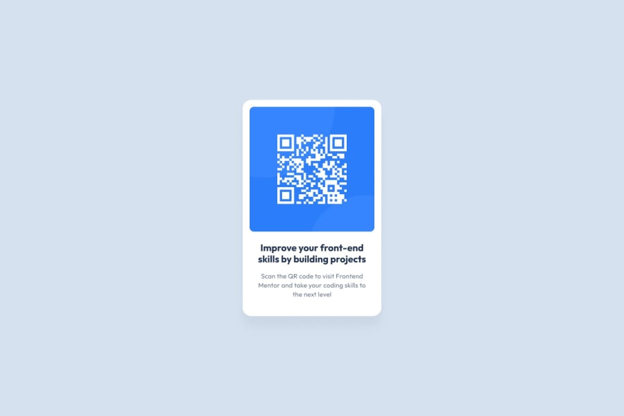
- The QR code is the main content of the website. So, it should have alternative text to be visible to everyone.
- Make the
<body>element as the card container. Then, make the<main>element the card. This way, you can remove the<div class="card">. - Remove
<div class="content">. Control the width of the text with thepaddingof the card. - In your CSS, I notice this selector
.card .content #card-titlewhile that only needs to be#card-title. Don't nest selectors unnecessarily. Remember to keep the CSS specificity as low and flat as possible. - Don't use
idselectors for styling. There are two reasons for not using ID’s to style content:- They mess up specificity because they are too high (the most important reason).
- They are unique identifiers. So, they are not reusable on the same page.
- Use a CSS reset whenever you start a new project. This can help you set the styling foundation easily. My recommendation — A Modern CSS Reset
I hope this helps.
0
Please log in to post a comment
Log in with GitHubJoin our Discord community
Join thousands of Frontend Mentor community members taking the challenges, sharing resources, helping each other, and chatting about all things front-end!
Join our Discord
