

Design comparison

Solution retrospective
Any feedback/thoughts are greatly appreciated!
Community feedback
- @MelvinAguilarPosted over 2 years ago
Hello there 👋. Good job on completing the challenge !
I have some suggestions about your code that might interest you.
HTML 📄:
- Use the
<footer>tag to wrap the footer of the page instead of the<div class="attribution">. The<footer>element contains information about the author of the page, the copyright, and other legal information.
- Always avoid skipping heading levels; Always start from
<h1>, followed by<h2>, and so on up to <h6> (<h1>,<h2>,...,<h6>). Swap the<h4>tag with<h1>
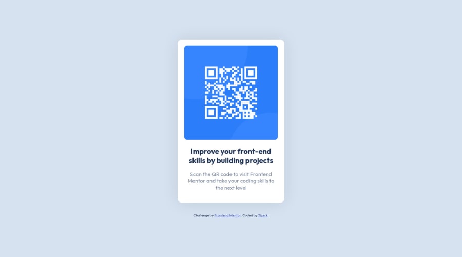
Alt text 📷:
-
The
altattribute should explain the purpose of the image. Uppon scanning the QR code, the user will be redirected to the frontendmentor.io website, so a betteraltattribute would beQR code to frontendmentor.ioIf you want to learn more about the
altattribute, you can read this article. 📘.
CSS 🎨:
- The
width: 100vwproperty in thebodytag is not necessary. Thebodytag is a block element and it will take the full width of the page by default.
- Use
min-height: 100vhinstead ofheight: 100vh. Theheightproperty will not work if the content of the page grows beyond the height of the viewport.
I hope you find it useful! 😄 Above all, the solution you submitted is great!
Happy coding!
Marked as helpful1 - Use the
- @CodeWithAlaminPosted over 2 years ago
Hi tizerk👋 Great job on completing this challenge! 🥳
I noticed a few areas where your solution to the challenge could be improved, and wanted to share my suggestions with you.
- The
.card-containerclass has a fixed width of 92% and a fixed height of 88%. This could cause issues with responsiveness on different screen sizes. Instead, it could be improved by using a more flexible layout such as usingmax-widthandmax-heightwith a percentage value, or using CSS Grid or Flexbox layout.
.card-container { max-width: 80%; max-height: 80%; margin: 0 auto; border-radius: 10px; }- The
.cart-btnclass has a fixed padding value of0.875remfor both the top and bottom. This could cause issues with responsiveness on different screen sizes. Instead, it could be improved by using a more flexible layout such as usingpaddingwith a percentage value.
    .cart-btn {
        padding: 1% 0%;
    }
Overall, this is a very well done solution to the challenge. Great job!
Hope I'm Helpful! 👍
Keep up the good work! 😊❤️
0 - The


Please log in to post a comment
Log in with GitHubJoin our Discord community
Join thousands of Frontend Mentor community members taking the challenges, sharing resources, helping each other, and chatting about all things front-end!
Join our Discord