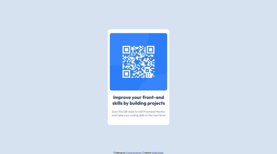
Design comparison
Solution retrospective
I am especially proud of the time it took me to finish this project. I estimated around 2 hours but managed to finish it in an hour. I am also happy with finally being comfortable using CSS flexbox since it has always been a bit of a struggle.
I would probably rethink the css properties that I have used for the overall layout. I am not sure is flexbox for body, and flexbox + position: absolute for the main component and footer is the best and common solution.
What challenges did you encounter, and how did you overcome them?The most challenging parts were:
- the layout of the page: should I use flexbox? Is the combination of flexbox and position: absolute for the footer the best option? Should I use grid for this page?
In the end I've decided to use flexbox & position: absolute for the footer for the overall layout.
- how to fit the image of the QR code.
I've set it's width to 60%, but I am not sure if that's the best solution.
What specific areas of your project would you like help with?I would be grateful for the feedback regarding:
- the overall layout solution: flexbox on the body + position: absolute on the footer. Is it a good solution and a common one?
- resizing the QR code image to fit the box? Is my solution to set it's width to: 60% a good one? Is there a better way to solve that part?
Community feedback
- @DanielfwwPosted 12 months ago
Hey Aneta - great job on finishing your first project!
The only thing that I would change its on the padding you did - if you do 5px or 10px inside your container you will see a difference there - image wise you can always adjust after but yeah changing width and height its how you would usually resize image.
Hope this helps even a little i powodzenia na nastepnych projektach.
1@NullishKoalaPosted 12 months ago@Danielfww dzięki wielkie! Yeah, I see it now how changing the padding would help here overall, thanks for pointing it out!
1 - @MtrxxoPosted 12 months ago
Hello, Your Solution's great...
Your Solution's a good one... And it's common
For you to fit the QR Image in the box... You can set height and width for the image and then give it a margin top and bottom of any value you desire and set margin left and right to "auto" which centers it on both sides... Other than that, great work
Happy Coding 😊✨
1@NullishKoalaPosted 12 months ago@Mtrxxo Thank you so much for your advice! Happy coding to you too ⭐😺
0
Please log in to post a comment
Log in with GitHubJoin our Discord community
Join thousands of Frontend Mentor community members taking the challenges, sharing resources, helping each other, and chatting about all things front-end!
Join our Discord
