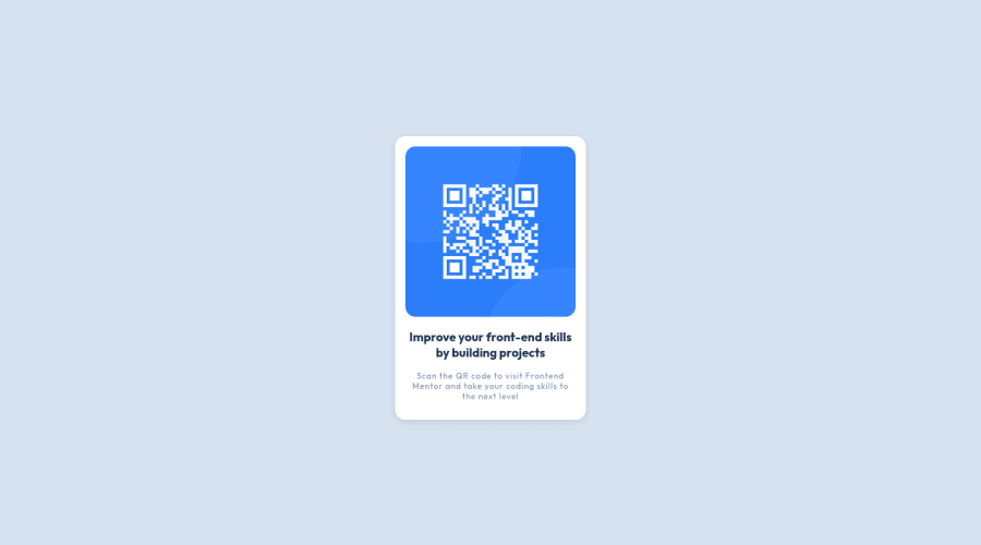
Design comparison
Community feedback
- @toonchavez8Posted almost 2 years ago
I'd like to congratulate you on completing the challenge; well done! Getting started can be daunting at first! Since you tagged this as #react #redux and #react route, I was curious to see how using react on this challenge would work. If this is the case, then perhaps you could update your tags if the repo is correct, otherwise, I'm not sure whether there might be confusion.
Secondly, in terms of your code, I took the liberty of reviewing it and in terms of the accessibility report, your HTML is missing 1 landmark element.
1: the main tag you should wrap your code after 19 and before line 30 in your index HTML and that should get you passing the accessibility report on here.
Ive been a fan of using import in css rather then link tags in html as ive been under the understanding that link tags while usefull will load before our markup this means that the more links we have and use the longer the page will take in providing content, i would suggest removing the link tags for the font and adding it yo the top of your css something like this
@import url(https://fonts.googleapis.com/css2?family=Outfit:wght@400;700&display=swap');other than that i believe the only other things i might suggest to modify are sizing but that at the end of the day thats really not game-breaking. i did check across multiple devices and your media quiery holds up so good job there!
Marked as helpful0
Please log in to post a comment
Log in with GitHubJoin our Discord community
Join thousands of Frontend Mentor community members taking the challenges, sharing resources, helping each other, and chatting about all things front-end!
Join our Discord
